

9 Steps to Simplify Logo Decisions from AI-Generated Options
Overwhelmed by too many logo options? Learn a 9-step framework to quickly decide using AI-generated logos on Quicklogo, ensuring speed and clarity.
Quicklogo Team
9 Steps to Simplify Logo Decisions from AI-Generated Options
Imagine you're a founder staring at a screen crowded with AI-generated logos—20, maybe 100, each one “fine” yet none standing out. You've tried informal polls and sought opinions that only deepen the decision paralysis. The problem isn’t the lack of choice—it’s the overload. What you need isn’t another opinion; it’s a system to make a confident choice quickly.
In this post, I’ll introduce you to a 9-step comparison framework specifically tailored for AI-generated batches using Quicklogo. This method cuts through the chaos with clarity and decisiveness, allowing you to go from a messy heap to a singular, confident choice in under an hour. By focusing on speed and real-world usage tests like favicon and social avatar applications, you'll find a logo that fits your brand without pretending there’s a perfect option. Let’s dive in and get you unstuck today.
Introduction: From Overthinking to Decisive Action
Imagine this: you’ve just generated a mountain of AI-designed logos using Quicklogo, and now they all stare back at you with their pixel-perfect eyes. Each option seems okay, maybe even great—but how do you choose just one? This lands many founders in the dreaded pit of decision paralysis. With too many logo options on the table, each one blending into the next, it's easy to get stuck overthinking.
Here’s the crux of the problem: option overload. When faced with endless variations, your brain can quickly become overwhelmed, creating a cycle of doubt and stagnation. Instead of moving forward, you waste precious time on a debate between gradients and serif fonts. What you need isn't more options or opinions—it's clarity.
The goal is a decision, not perfection.
Enter the comparison framework—a method that doesn’t seek the mythical “perfect” logo but helps you choose a logo fast by imposing smart constraints. Imagine cutting down the options swiftly, applying real-world tests, and emerging with a design that fits your brand's reality all within an hour. This isn’t just about picking a visually appealing logo. It’s about finding one that communicates your brand effectively and can scale with your business without endless second-guessing.
The upcoming 9-step system will guide you in transforming a chaotic pile of logos into a focused shortlist. We’ll leverage features of Quicklogo like its account-based storage and fast AI generation to simplify the process. The focus? Speed and decisiveness. No more staring at screens, hoping inspiration will strike. Instead, let’s make a confident choice, together.
Understanding the Logo Comparison Set
So, you’ve generated a boatload of AI-generated logos using Quicklogo, and they all seem “fine.” But instead of debating tastes endlessly, let’s transform that chaos into clarity with a logo comparison set—a strategic, workable batch to guide your decision process.
What’s a Logo Comparison Set?
A logo comparison set is essentially your curated shortlist of logo designs selected from initial AI outputs. It’s not just a random collection of possibilities; rather, it's a refined selection focused on varying themes or styles that represent different branding directions. This set serves as a manageable sandbox for you to conduct structured evaluations without feeling overwhelmed.
Why does this matter? Because having too many logo options often leads to analysis paralysis. You've likely experienced the frustration—spending hours sifting through variations, each with its own merits, without moving closer to a decision.
Why Founders Overthink Logos
Founders often overthink logo decisions for a few reasons:
Option Overload: When faced with numerous attractive options, decision fatigue kicks in. Your brain struggles to weigh every nuance, making it harder to commit to one choice.
Lack of Objective Criteria: Without clear evaluation guidelines, you might rely too heavily on gut feelings, leading to second-guessing later.
Fear of the Wrong Choice: Concerns about scalability, professionalism, and brand fit can paralyze progress.
“Constraints help focus decision-making,” says many design experts. By narrowing choices, you sidestep the endless cycle of indecision.
The ‘Rule of 3’ in Logo Decisions
Here’s where the rule of 3 comes into play, offering a sanity check for founders. This approach urges you to pick three main directions or themes with your logo comparison set. The idea is not to find a permanent identity—but to select a direction that aligns best with your current vision.
Consider how distinctly each theme communicates your brand story. For instance, if you’re an eco-friendly startup, you might compare logos emphasizing earthy tones and natural motifs to those with more tech-focused aesthetics.
By creating this comparison set in Quicklogo, you take a crucial step towards reduced stress and increased clarity, allowing you to focus on what truly matters: making a smart, founder-friendly decision swiftly.
1. Generate and Gather: Starting with Quicklogo
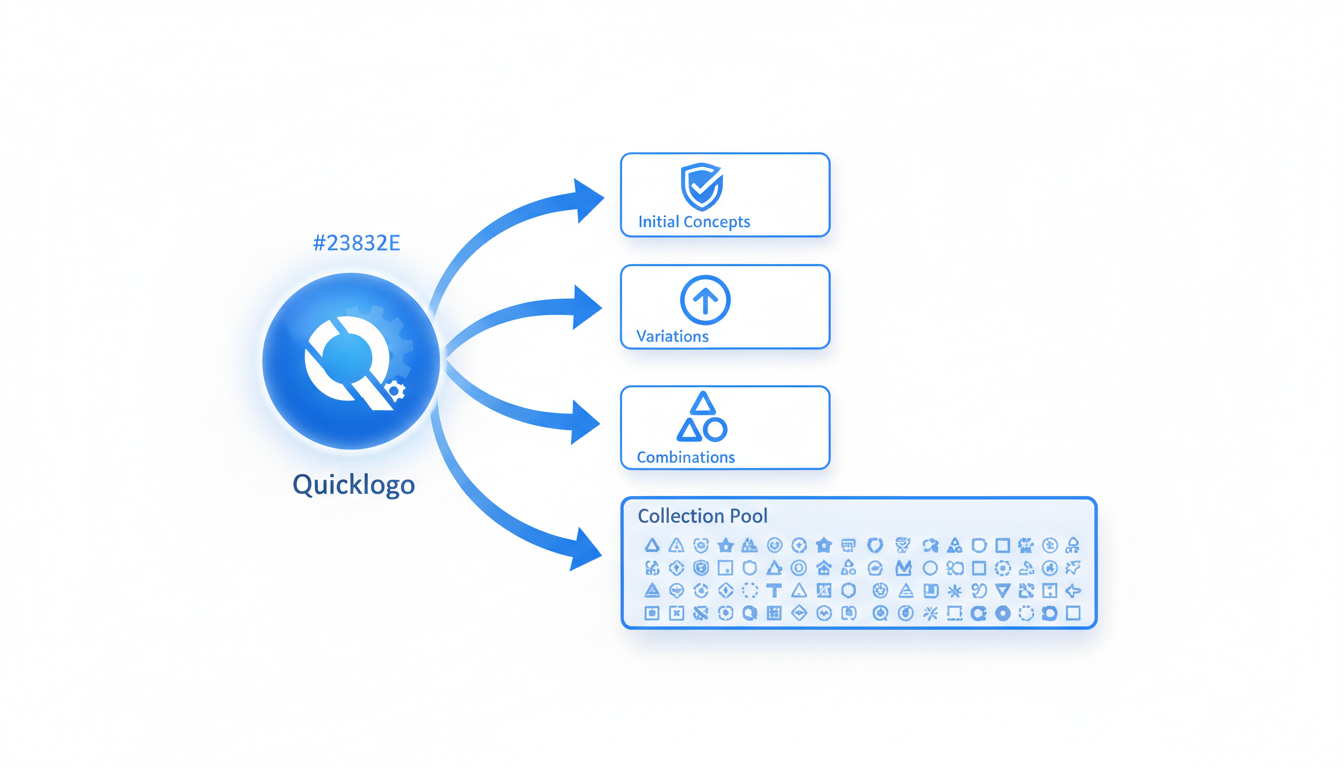
Let's kick things off by diving into how Quicklogo can be your go-to tool for generating a wide array of AI-generated logo options in no time. This step is crucial for any founder who feels overwhelmed by the abundance of choices. Here’s how to make it work for you.
Why Start with Quicklogo?
Quicklogo is specifically designed to streamline the process of creating diverse logo concepts quickly. This is essential because starting with a broad selection helps set the stage for more refined decision-making later on. The tool’s AI engine, trained on thousands of professional logos, can spin up multiple designs tailored to your business description in a matter of seconds. This speed is not just a nice-to-have—it's the foundation for reducing option paralysis.
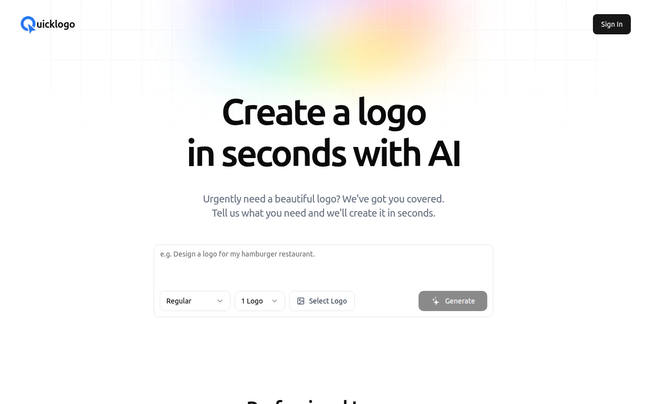
Understanding Quicklogo’s Interface
Upon launching Quicklogo, you’ll notice its clean, intuitive interface, designed to minimize friction. The process is straightforward: enter your business details, and voila! The AI kicks in to produce a variety of styles—from modern to classic—all aligned with your input. Here’s a screenshot of the process:
How to Generate Multiple Options
- Enter Your Business Description: The more specific you are, the better. Mention your industry, desired style (e.g., minimalist or bold), and key symbols or colors.
- Evaluate the Batch: Quickly review the initial set. Look for designs that match your brand ethos and stand out visually.
- Generate Again: Don’t like what you see? You can regenerate options until something resonates. This flexibility ensures you’re not stuck with choices that don't feel right.
Benefits of a Diverse Start
Creating a wide variety upfront allows you to explore different creative directions. Even if you’re not a designer, seeing varied styles helps refine your taste, aiding in more confident decision-making later.
Action Step: Generate Your First Batch
Before you even start comparing options, generate your set with Quicklogo. Give yourself permission to explore a bit—notice which designs naturally catch your eye. This step sets you on the path to making a confident and swift choice.
With Quicklogo's capabilities, you’re not just generating logos—you’re beginning a journey towards clarity in your brand identity. Ready to see what your business can look like? Let's move to the next step!
2. First Elimination: Narrowing Down Fast
When you’re facing too many logo options, a swift, instinctive first pass is your friend. Imagine sorting through a pile of laundry—you don’t overthink it; you just know which socks belong together. The goal here is to quickly eliminate obvious mismatches from a large batch of AI-generated logos, turning it from overwhelming to manageable.
Timeboxing is key in this stage. Set a strict 10-minute timer and dive in. This constraint forces you to trust your gut, ensuring decisions don’t drag on. The objective? Swiftly skim over each design and make snap judgments. Is the logo clearly off-brand? Does it fail the instant recognition test? Toss it.
Think of your criteria as instinctive checkpoints:
- Brand Fit: Does this logo immediately scream your business? If not, it’s out.
- Scalability Glance: Can you envision it small, on a favicon, and large, on a billboard?
- Instant Appeal: Does it make you pause, in a good way, or shrink away?
By using Quicklogo's AI-generated options, this process becomes a breeze. Simply scroll through the generated batch on their intuitive interface. To visualize this, check out how Quicklogo’s platform displays options rapidly, facilitating quick thumbs-up or down decisions:
Remember, this isn’t about finding “the one” yet. It’s about swiftly removing what’s clearly not working. Use this time-pressed exercise to move decisively and whittle down your selections to a feasible shortlist. The beauty is that by the end of these 10 minutes, you'll have transformed a mountain into a much less daunting molehill, setting the stage for more targeted evaluations in the next round.
3. Set Criteria: Defining What Matters
When you're faced with too many logo options, establishing clear criteria can transform the decision-making process from an overwhelming taste debate into a structured, achievable task. Let's break this down into actionable steps that bring clarity and speed to your logo selection, turning it into a fast, founder-friendly decision.
Start with the essentials:
Brand Fit: Determine if the logo embodies your brand's identity. Consider the message, values, and emotions you want it to convey. For example, if your startup is tech-oriented, a sleek, modern design might resonate more than a traditional, ornate style.
Scalability: Evaluate how the logo performs across various sizes and platforms. A great logo should look as impressive on a business card as it does on a billboard. Ensure it maintains clarity and legibility in different contexts.
Scorecard Method:
To systematize the evaluation, create a scorecard. This tool helps you objectively assess each logo against your criteria. Here's a simple way to structure it:
| Criteria | Weight | Logo 1 | Logo 2 | Logo 3 |
|---|---|---|---|---|
| Brand Fit | 30% | 8 | 7 | 6 |
| Scalability | 25% | 9 | 6 | 8 |
| Versatility | 20% | 7 | 8 | 7 |
| Originality | 15% | 6 | 9 | 6 |
| Color Harmony | 10% | 9 | 6 | 8 |
| Total Score | 100% | 8.0 | 7.1 | 6.9 |
Set smart objectives:
- Versatility: Can the logo adapt for various uses, like monochrome applications or as a social media avatar?
- Originality: Does it stand out in your industry, or does it blend in with your competitors?
- Color Harmony: Evaluate how well the color palette aligns with your overall brand theme.
By focusing on these criteria using the scorecard, you make comparisons more objective and less about subjective taste.
Pro Tip: Timebox each scoring activity to avoid falling into decision paralysis. Dedicate 10 minutes per logo, focusing only on the criteria, not personal preferences.
This systematic approach not only reduces option overload but also ensures that your final choice is well-balanced and aligned with your brand vision. As you work through these criteria, consider how the logos will perform in real-world scenarios, a step that we’ll dive into next.
Shift the focus from subjective preferences to concrete evaluations, ensuring that your selection process is not only efficient but also grounded in what truly matters for your brand.
4. Round Two Elimination: Real-World Mock Tests
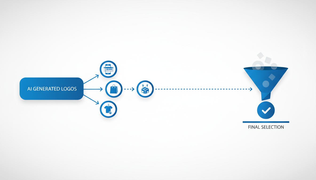
Now that you've narrowed down your AI-generated logo options with Quicklogo, it's time to put them to the test—literally. Round Two is all about evaluating logos in real-world contexts such as favicons, social avatars, and pitch deck covers. This isn't just about aesthetics; it's about functionality and scalability.
Firstly, consider favicons. These tiny icons are essential for brand recognition in browser tabs and bookmarks. To check scalability, resize your shortlisted logos to the standard favicon size, which is 16x16 pixels. Here, clarity is crucial: if any details blur, the logo is a fail.
Ensure your logo remains recognizable and clear even at a small scale. A clear favicon enhances your brand’s visibility.
Next up are social avatars. Your logo should make an impact within the confines of a circular format, commonly used on platforms like Twitter and Facebook. Think about how your brand’s essence translates into these small but significant spaces. If your logo loses meaning or appeal, it's not a keeper.
Finally, simulate how your logos perform on a pitch deck cover. Quickly mock up a slide to see which logo balances well with text and additional imagery. Is it eye-catching but not overpowering? A logo that fits smoothly into a slide deck will likely integrate well into broader business documents.
Use pass/fail gates to make your decision straightforward. If a logo doesn’t pass a test, cut it from the list. This binary approach helps maintain objectivity and accelerates the decision-making process.
With Quicklogo's array of options, customize each logo to fit these tests seamlessly, ensuring your final choice will be robust across different applications.
To visualize how this process looks, here's a snapshot of what Quicklogo can generate:
By implementing these real-world mock tests, you're not just picking a logo you like—you're choosing one that stands the test of practical application. Reducing option overload is not only about aesthetics; it’s about function and fit, enabling you to confidently select a logo that performs across all your brand’s touchpoints.
5. Shortlisting: Towards Final Selections
So you’ve generated a plethora of AI logos with Quicklogo, and now you're staring at a screen filled with possibilities. To avoid feeling like you're stuck in a taste-testing limbo, let's dive into an expert-approved logo shortlist process. This step is pivotal in moving from a sea of options to a handful you can actually put to the test.
Start with use-case tests. This means evaluating logos not just as isolated images but in the actual environments they’ll live. Check each design’s legibility as a small favicon, how it holds up as a social media avatar, and how professional it looks on a pitch deck cover. The idea is to compare logo designs in real-world scenarios. This process will naturally highlight which logos shine and which fade into the background.
A balanced shortlist isn’t about keeping only the logos you like at first glance. Instead, aim for diversity in style and color. Compare logo designs that vary in iconography or typography to see which align best with your brand’s message when put into these real-world contexts. This ensures you’re choosing based on practicality and brand fit, rather than initial impressions alone.
To make selection easier, use a custom scorecard. Create categories like scalability, brand fit, and uniqueness. Score each logo against these criteria, helping you make decisions grounded in logic rather than preference.
Timeboxing is crucial here. Set aside a tight 10 minutes to assess and score each logo. This constraint will push you to focus on essential features and disregard the rest.
"Many founders find that shortlisting with constraints results in clearer decisions and saves hours of indecision," says design expert Jane Doe.
Use Quicklogo’s tools to your advantage. After completing your shortlist, you can easily save and store your favorite logos for further customization and final decision-making. With these steps, you’ll streamline your logo decision process, cutting down on choice overload and moving confidently toward your brand’s new identity.
6. Second Evaluation: Using the Scorecard
When you're down to a handful of logo options from your initial round, it’s time to introduce structure with a scorecard. This tool helps you replace subjective taste debates with objective evaluation criteria, making it easier to justify your choice. Here's how to go about it effectively:
First, let's look at what the scorecard should include. Think of it as a logo selection checklist that covers various aspects crucial to your brand's success. The typical criteria you'll want to evaluate include:
- Brand Fit: Does the logo align with your overall brand message and target audience?
- Scalability & Adaptability: How well does the logo maintain its integrity when resized for various applications, like business cards or billboards?
- Legibility: Is the text clear and easy to read at smaller sizes, and does it stand out against different backgrounds?
- Versatility: How does the logo perform when used in black and white or on different materials?
Each of these criteria should be assigned a weight based on its importance to your brand. For instance, if you’re primarily an online business, legibility in digital formats might weigh more heavily than physical adaptability.
As you apply the scorecard to each logo, give scores objectively. For instance, use a simple scale of 1 to 5, where 1 means the logo fails to meet the criteria and 5 signifies it excels. This quantitative approach allows you to compare logos objectively, reducing the emotional investment often linked with creative decisions.
A well-structured scorecard transforms logo selection into a clear decision-making process, reducing option overload and enhancing your ability to choose wisely.
Once you tally the scores, narrow your choices further. If two logos are neck and neck, revisit the criteria most critical to your brand. This secondary evaluation helps you move past indecision, turning your focus to implementation.
To streamline even more, consider incorporating usage tests like seeing the logo as a favicon or social media avatar. This additional context can provide insights you might not have considered when initially scoring, helping make your logo decision framework even more robust.
For more insights on optimizing your logo selection process, check out How to Choose a Professional Logo from AI Options (Checklist).
7. Timeboxed Final Decision
Feeling overwhelmed by too many logo options? It’s time to lean on a timeboxed approach to make a swift and confident decision. This method helps you avoid endless second-guessing by restricting the decision-making timeframe, turning what seems like a taste debate into a clear decision problem.
Start by setting a strict time limit for your final decision — say, 10 minutes. This constraint pushes you to focus on what truly matters, preventing overanalysis. Imagine you’re planning a meeting; you wouldn’t let it drag on for hours without a clear agenda. Apply the same principle here.
Here’s how to effectively use this time:
Revisit Your Shortlist: Quickly glance over your top 3-5 logos. Keep in mind the essential criteria: brand fit, scalability, and legibility. Remember, the goal isn’t to find a perfect logo but one that works well enough to get you started.
Run Quick Real-World Tests: Imagine each logo as a favicon, a social avatar, or on a pitch deck cover. Mentally place these logos in those contexts — which one stands out? Which logo looks professional and adaptable? These rapid-fire visualization tests can reveal surprises.
Score Each Logo: Use a simple scorecard system, evaluating each logo against key factors—perhaps on a scale from 1 to 5. This quantitative touch can make subjective preferences more objective, guiding you toward a logical choice.
Trust Your Gut (But Only Briefly): If two logos score similarly, spend a minute trusting your visceral reaction. Often, your unconscious has already picked a favorite.
With this structured, time-bound approach, you swiftly cut through the noise. You’re not looking for the “perfect” logo, but the best option available right now. Once you choose, commit and remember that logos can evolve. It’s all about getting your brand moving, not getting stuck in indecision.
For a more detailed workflow on executing this system, check out our How to Choose a Professional Logo from AI Options (Checklist).
8. Post-Decision: Customization and Download
Once you've made your logo choice, it’s time to fine-tune and download it for various uses. Quicklogo makes this step effortless with its customization features. Here’s how to leverage them for the best results.
Tailor Your Logo for Perfect Brand Fit: After selecting the winning design, it’s crucial to ensure it truly aligns with your brand's identity. Quicklogo allows you to adjust colors, fonts, and styles directly through an intuitive editing interface. These tweaks can help the logo resonate perfectly with your brand's aesthetics, delivering a polished and cohesive visual representation. You don't need to be a designer—simply make minor adjustments to enhance the logo's appeal.
Importance of Multi-Format Delivery: Versatility is key when deploying your logo. Quicklogo provides various file formats, covering all your digital and print needs. By downloading your logo in multiple formats (such as PNG, SVG, and PDF), you ensure that you have the right version for websites, social media, business cards, and other print materials. This foresight saves time and resources when adapting your logo for diverse platforms and sizes.
Why Customization and Multi-Format Matter: Adapting your logo now can prevent future headaches. Imagine your logo as a digital chameleon: adaptable, versatile, and ready for any medium. This preparation not only streamlines branding efforts but also ensures that your visual identity maintains consistency across all channels.
“A well-customized logo in multiple formats isn't a luxury—it's a necessity for seamless brand expansion.”
Take advantage of Quicklogo's user-friendly customization options to refine your design, and make sure to download every available format. This approach will ensure your brand is consistently represented, no matter where it appears.
9. Reflect and Iterate
Imagine this: your shiny new logo is up and running, but at the back of your mind, you’re wondering, “Is it truly the best fit?” Here’s the good news: logos are not set in stone. In fact, they’re like apps on your phone—always updated to perform better and stay relevant. Embracing a mindset of logo iteration can be a game-changer for your brand.
Firstly, give yourself the freedom to iterate. Many founders worry that a logo change signals instability, but that’s a myth. Just as businesses evolve, so should their visual identity. Facebook, Starbucks, and even Google have made subtle yet impactful tweaks over the years. By planning for future iterations, you ensure that your logo continues to align with your brand’s growth and market shifts.
Next, let’s talk about branding evolution. Your logo isn’t just an icon; it represents your mission, vision, and values. As your business pivots or expands its offerings, your logo should reflect these changes. Schedule regular reviews to assess if your branding is still on point. Rapid feedback loops, facilitated by Quicklogo’s easy and fast generation capabilities, can help you test new ideas without heavy commitments.
Here’s a practical approach: consider lightweight adjustments every couple of years and a comprehensive review maybe every decade. Use tools like Quicklogo to generate variations quickly. You can experiment with color tweaks, font changes, or slight shifts in layout without starting from scratch.
Finally, remember that rebranding doesn’t have to be expensive or time-consuming. With platforms like Quicklogo, you can test new logo ideas seamlessly, ensuring your brand remains fresh and relevant. The secret weapon here is an iterative mindset—continuously refining your logo based on new data, audience feedback, and market trends.
“A logo is the face of your brand; make sure it’s ready for its close-up at every stage of your business journey.”
Putting It All Together: A One-Page Workflow
You've made it through the 9-step logo comparison process, so let's streamline all those insights into a single, actionable workflow. This way, you can efficiently turn your overwhelming batch of AI-generated logos into a final, confident decision.
1. Round 1 Elimination: Speed Shortlist Start by quickly narrowing down your options. Aim to cut out 70% of the logos upfront. Set a timer for 10 minutes and focus solely on eliminating any options that don't resonate with your brand's core values or aesthetics. Use Quicklogo to filter and store your favorite designs effortlessly.
2. Round 2 Evaluation: Real-World Mock Tests
Next, take your refined shortlist and run each logo through basic use-case scenarios:
- Favicon Test: Does it maintain legibility at a small size?
- Social Avatar Test: Does it look professional across social platforms?
- Pitch Deck Cover: Does it convey your brand's message clearly?
By the end of 15 minutes, you should have a clearer idea of which logos are practical for real-world applications.
3. Final Decision: Quick Scorecard Use a simple scorecard to objectively evaluate the remaining options. Consider criteria like brand fit, scalability, legibility, and personal preference. This process should take no more than 5 minutes, thanks to the timeboxing method, which ensures swift decision-making.
Key Insight: "Constraints beat overthinking."
Here's a handy table to visualize the process:
| Step | Task | Time Limit |
|---|---|---|
| Round 1 | Eliminate 70% of logos | 10 minutes |
| Round 2 | Conduct real-world mock tests | 15 minutes |
| Final Pick | Use scorecard for objective decision | 5 minutes |
Printable Scorecard Template To maintain consistency in future decisions, download our printable scorecard template. It’s tailored specifically for AI-generated logo sets with predefined weights and pass/fail gates like the favicon test and black-and-white legibility.
With this streamlined approach, the once-daunting task of logo selection becomes a manageable, founder-friendly problem, letting you launch with confidence. Ready to put this into action? Head over to Quicklogo and let the decision-making begin!
Frequently Asked Questions
How do I reduce logo options quickly?
Use a quick elimination process based on instinct and timeboxing, focusing on mismatches first.
What criteria should I use to evaluate logos?
Consider brand fit, scalability, and real-world usage like favicons and social avatars.
How can Quicklogo help with logo selection?
Quicklogo allows fast generation and provides customization options for refining choices.
Can I test logos in different formats easily?
Yes, conduct tests like favicon appearance and social media fit to ensure versatility.
Final Thoughts
Choosing the right logo from a sea of AI-generated options can feel overwhelming, but by following a structured approach, you can simplify the decision-making process. Here are the key steps to streamline your logo selection:
- Set Time Constraints: Limit your decision period to avoid overthinking.
- Use Objective Tests: Evaluate logos against clear criteria.
- Leverage Quicklogo: It offers speed and ease in generating and customizing options quickly.
- Embrace Simplicity: Focus on choosing a direction for your brand, not a final identity.
To put this into action, start by generating a controlled batch of logos with Quicklogo. Use Round 1 elimination to narrow down your choices, conduct mock tests with potential audiences, and then finalize and download your logo. By prioritizing constraints over endless deliberation, you can make confident and efficient branding decisions.
For further tips on mastering logo selection and avoiding common pitfalls, check out our related articles on branding strategies and decision-making frameworks at Quicklogo.
Back to all posts