

How to Get a Logo for Your Website (Header + Favicon Basics)
Discover a complete guide to getting a logo onto your website header and favicon correctly, with tips from modern logo trends to asset preparation.
Quicklogo Team
How to Get a Logo for Your Website (Header + Favicon Basics)
Your logo looks impeccable in a file, yet somehow it breaks in your website header and turns into an unrecognizable mush in the browser tab. Sound familiar? You’re not alone. Founders and small business owners often face this challenge when transforming a conceptual logo into a crisp website asset. You need two things: a flawless header logo and a clear favicon. In the next 30–60 minutes, we’ll guide you through a step-by-step process to achieve both. From navigating modern logo trends like nostalgia and dimensionality to mastering responsive sizing, Quicklogo will be your ally in delivering web-ready assets with ease. Let's dive in to make sure your logo looks perfect everywhere.
Introduction: Why Your Website Logo Matters
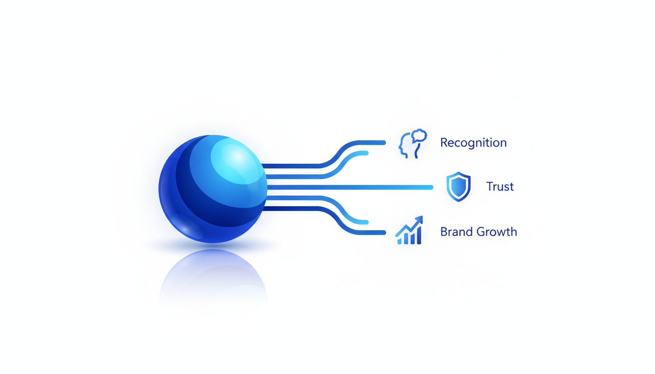
Your website logo is more than just a visual—it's your brand's first impression. When visitors land on your page, the logo immediately sets the tone and communicates your business's core identity. But getting it right involves more than just tossing an image onto your site. You have to navigate both aesthetic and technical considerations, treating your logo as not only a design piece but a vital asset in UI navigation.
When designing a logo for your website, you need to think about two specific deliverables: the header logo and the favicon. Each serves a distinct purpose:
The header logo is your brand's visual ambassador, visible on every page. It must maintain clarity and impact across various screen sizes, from the widescreen desktop to the handheld mobile. Aligning with 2025's trends of authenticity and dimensionality, consider how pixel art nostalgia or 3D elements can add depth and originality.
The favicon might be tiny, but it plays a pivotal role in brand recognition. As the little icon in browser tabs, bookmarks, and more, it ensures your brand is always visible—even off the main page. Achieving a clean favicon requires a simplified version of your logo that retains its essence at a minuscule size, tapping into the ultra-simplified scalability trend seen in designs like those of Juventus football club.
Quicklogo offers a simple, step-by-step generation process that empowers you to produce professional logos quickly, ensuring you get web-ready files tailored to your needs. It caters specifically to founders and small business owners by offering useful customization options and multi-format file delivery, helping you launch your brand visually with ease.
Stay tuned as we guide you through creating a crisp website header logo and a clean favicon, ensuring they're prepared with the perfect website logo sizes and formats. Whether you're working with retro pixel motifs or modern minimalist aesthetics, we've got you covered.
Understanding Modern Logo Trends for 2025
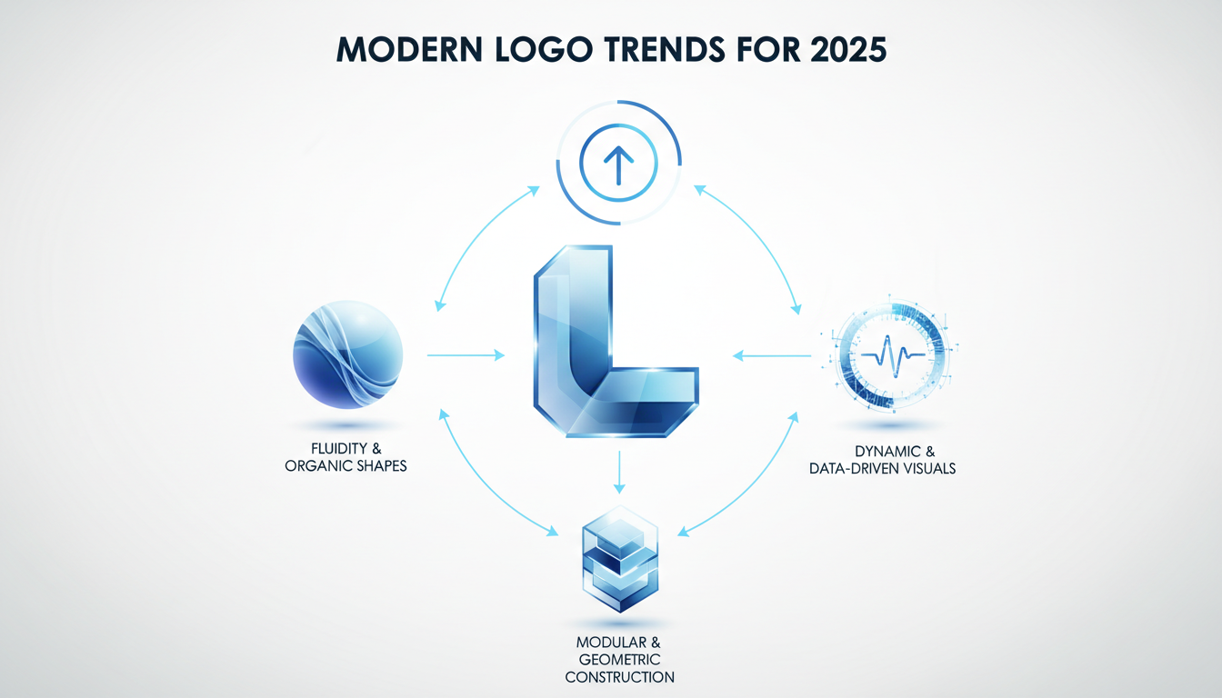
Navigating modern logo trends in 2025 involves embracing a fusion of authenticity and innovation. Today, logos are more than just visual markers; they capture the essence and personality of a brand. Here’s how you can align your branding efforts with the latest trends.
Embracing Authenticity and Hand-Drawn Elements
Gone are the days of overly polished, perfect logos. In 2025, consumers are drawn to designs that feel real and personal. Brands often look for authenticity in logo design, conveying a human touch in a digital world. These elements convey authenticity, showing a brand’s unique story rather than a generic image. Ensure your logo captures this personalized essence by integrating organic lines or unique typography.
The Pixel Art Revival
Remember the iconic pixelated graphics from the 90s? They're back, and they appeal especially to Gen Z, a demographic nostalgic for those retro aesthetics. PixelStrikeCreative highlights how pixel art is making a comeback, as seen in Mozilla’s 2024 rebrand with pixel-inspired typefaces. To leverage this trend, consider incorporating pixel art to add a playful, nostalgic touch to your logo. This revival not only pays homage to the past but also connects with younger audiences in a meaningful way.
Motion-First Adaptive Logos
With the rise of dynamic digital environments, motion-first and adaptive logos have become essential. As discussed by Wix and Looka, these logos adjust and animate depending on where and how they’re displayed—whether on a mobile app or a desktop site. Incorporating movement can boost engagement and help your brand stand out. Think of how your logo can be versatile yet consistent across different platforms. This might include subtle animations or responsive designs that adapt to varying screen sizes.
Incorporating these trends into your logo design ensures that it not only aligns with current aesthetic preferences but also stands the test of time. Whether it's authenticity, nostalgia, or adaptability, aligning with these 2025 trends can create a more engaging and lasting brand identity.
Choosing the Right Logo for Website Headers
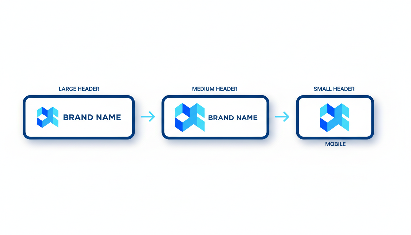
Your logo may look slick on your computer, but when it's placed in a website header, suddenly things can go awry. The trickiest part is ensuring it maintains its integrity across various devices and themes, such as light and dark modes. Here’s how to navigate this with ease.
Importance of Sizing and Spacing within Navbars
First things first, let’s talk about sizing. Your logo should balance between being prominent but not overpowering. Typically, logos in headers fall within the 250px width range, but it often depends on your navbar's height, which may range from 50px to 80px. A good rule of thumb is to keep the logo no taller than 70% of your navbar's height to maintain a clean and uncluttered look.
Spacing, or the logo safe area, is equally vital. Ensure there’s enough padding around your logo. This not only enhances readability but also avoids the dreaded cramped look. Aim for at least 10px of breathing room on all sides.
Quick Tip: Use vector formats like SVG for crisp scaling across different devices.
Logotype vs. Icon Decisions
Now, let’s get into the logotype versus icon debate. If your header has limited vertical space, consider using a simple, recognizable icon rather than a full logotype. Icon-only logos are not only trendy but also scale well, maintaining clarity even when reduced to favicon size for browser tabs.
For larger headers, a horizontal logotype might work perfectly. It's all about balancing appearance with function and considering your responsive logo needs.
Adapting Color and Contrast for Light and Dark Modes
Modern websites often feature both light and dark modes, meaning your logo needs to be adaptable. You should create both light and dark variants of your logo to ensure it contrasts well with the background.
Use bold colors or contrasting shades to make sure your logo stands out regardless of the theme. For example, a white logo won't pop on a light background, so you’d need a dark version for those scenarios.
Emerging Trends to Consider
According to current design trends, authentic and nostalgia-driven elements are making a comeback, including pixel art logos, and Mozilla’s pixel-inspired rebrand underscores this shift. For a more modern twist, consider integrating 3D effects or motion-infused designs for an adaptive, engaging brand mark. However, keep in mind the technical constraints of your website’s header and ensure these elements don't compromise readability.
Expert Insight: Simplified, scalable logos — especially for small-business websites — improve cross-device compatibility and future-proof your brand against design shifts.
Practical Implementation
You don’t need to be a designer to get it right. Quicklogo offers a streamlined, AI-driven way to generate and customize professional logo options quickly, ensuring you get web-ready files tailored to your needs. Simply define your requirements, and let the AI deliver fast results.
With these considerations, you’ll ship a crisp and clear website header logo that looks professional across both desktop and mobile, without the guesswork.
Preparing Your Logo: Sizing and Padding Essentials
When setting up your logo for a website, understanding logo dimensions for websites and the importance of padding is critical. Let’s dive into how you can ensure your logo looks impeccable across all devices.
Standard Header Logo Sizes and Responsive Breakpoints
The first thing to consider is the header logo size. Typically, you want your website logo to be between 250x100 pixels and 400x100 pixels for desktop displays. These dimensions ensure your logo is prominent but not overpowering. However, websites often display differently across devices, so it’s wise to prepare a few variations.
- For mobile devices, a logo should often scale down to 150x50 pixels or smaller. Modern site builders, like Wix or Webflow, often include responsive breakpoints that adjust your logo’s size automatically. Make sure your design is legible and maintains its identity even when scaled down.
Safe Padding and Clear Space
Next, implementing adequate padding—also known as clear space around your logo—is essential for readability and aesthetics. This space prevents your logo from feeling cramped or squished against other site elements like navigation links.
- A general rule is to keep at least 20% of the logo’s height as clear space around it. This ensures your logo breathes well within the navbar and improves its visual impact.
Utilizing SVG Formats for Scalability
The choice of file format significantly impacts how your logo appears online. SVG (Scalable Vector Graphics) format is ideal for web logos because it scales without losing quality. Unlike raster-based images, SVGs retain crisp edges and detail, no matter the size—whether it's on a large desktop monitor or a small smartphone screen.
- Additionally, SVGs support transparent backgrounds, making them versatile across different design contexts. This becomes vital if you’re considering dark and light mode adaptations for your site.
"Using SVGs for web logos ensures they are future-proof, adapting seamlessly to the varied resolutions of modern displays," according to numerous experts from Looka and DesignMantic.
By understanding these essentials—sizing, responsive breakpoints, and leveraging SVG formats—you can ensure your logo remains a strong visual asset across your site. Quicklogo provides a streamlined way to generate, customize, and export your logo in all necessary formats, which can save you significant time and effort. For further customization, explore how Quicklogo supports various tools to align your logo with your brand identity perfectly.
Exporting Your Logo for Web Use: Files, Formats, and Storage
Navigating the world of file formats can feel like wading through a digital jungle. But fear not—understanding the differences between SVG, PNG, and JPEG formats can significantly impact your website’s performance and aesthetics. Let’s dive into when and how to use each format, ensuring your logo looks sharp across all digital platforms.
Decoding File Formats
SVG (Scalable Vector Graphics): If scalability and crispness are your priorities, SVG is your go-to format. Designed to be resolution-independent, SVG files maintain quality at any size—making them ideal for responsive logos that need to look sharp on both mobile devices and retina displays. Plus, they support transparency and can be utilized for animations, aligning with the 2025 trend of motion-first and adaptive logos.
PNG (Portable Network Graphics): Best for images that require a transparent background, PNG is perfect for website headers where you want the logo to seamlessly blend into various sections of your page, whether it’s light, dark, or a vibrant gradient. Unlike JPEGs, PNGs retain detail and clarity, making them superb for icons and favicons where detail matters at smaller sizes.
JPEG (Joint Photographic Experts Group): Though not commonly favored for logos due to lacking transparency, JPEGs can still serve purposes where file size must be minimized. They’re most useful for photographic logos or when high-resolution previews are necessary.
When to Use Transparent Backgrounds
Transparency takes your logo to a new level of versatility, allowing for smooth integration onto varying backgrounds without a harsh border. This feature is essential for PNGs and SVGs, especially for logos placed over photos or textured headers. Ensure your logo designer or tool, like Quicklogo, delivers these formats with transparent backgrounds to maintain a professional appearance across all platforms.
Maximize Readiness with Quicklogo
Quicklogo’s multi-format delivery ensures your assets are web-ready, packaging logos in SVG, PNG, and more, allowing for seamless implementation whether in a website header or as a favicon. With Quicklogo, downloading these formats is straightforward, so you’re never caught exporting random files that don’t fit your needs.
Moreover, storing your logo files securely is crucial. Always keep original and edited files in a safe, accessible place to easily manage updates and maintain brand consistency. Quicklogo provides an intuitive solution for this by allowing storage and management of your logo assets directly within their platform.
Ultimately, selecting the right file format and maintaining proper storage practices can dramatically improve how your logo interacts within your site’s real estate. Using Quicklogo to confidently deliver, customize, and store your assets sets a strong foundation for your brand’s digital presence.
Crafting the Perfect Favicon: Size and Design Considerations
Let's dive into the world of favicons—those tiny yet mighty icons you see in browser tabs. A well-designed favicon can enhance brand recognition with just a glance, but getting it right involves understanding the nuances of favicon logo size and design.
Understanding Favicon Sizes
First up, let's talk dimensions. Favicons traditionally existed in a modest 16x16 pixels size, but today’s digital landscape offers a bit more flexibility. For most uses, a size of 32x32 pixels ensures clarity on high-resolution displays and different devices. Larger sizes like 48x48 or even 64x64 pixels are suitable for web applications or when a clearer icon is desired at higher resolutions. You can also consider adaptive favicon formats like SVG for scalable needs.
Quick Tip: Ensure your favicon remains clear and recognizable even at the smallest sizes—think minimalist and iconic.
Designing Scalable and Recognizable Icons
With limited space, clutter is the enemy. Stick to simple shapes or your brand’s core icon, ensuring it’s distinct enough to stand out on various backgrounds. Utilize bold colors to increase visibility, but maintain balance with your overall site theme. The trend of ultra-simplified scalability emphasizes the use of minimalist designs that resonate with modern aesthetics and maintain clarity across different sizes.
Consider incorporating elements from 2025’s logo design trends such as dimensionality or pixel art, which not only add character but also echo nostalgic vibes appealing especially to younger audiences, according to PixelStrikeCreative. By utilizing adaptive designs that fit seamlessly into various devices, you’re also aligning with the motion-first trend—a modern must in responsive design.
Utilizing Site Icon Makers for Efficiency
Harnessing a site icon maker, like Quicklogo, can streamline favicon creation. Quicklogo lets you generate, customize, and download your favicon in multiple formats, including PNG and SVG, ensuring they suit both web and app needs. With Quicklogo, you also secure ownership rights to modify and utilize your creations freely, a concern for many founders transitioning from concept to execution.
To create your perfect favicon with Quicklogo:
- Enter your brand details and preferences.
- Select from a variety of professionally generated icon options.
- Customize to suit your brand’s needs—adapting colors and styles.
- Download in multiple sizes/formats to cover all your bases.
Quick Checks and Common Mistakes
Before you hit the upload button, run a quick check:
- Is the icon clearly visible and distinct even at 16x16 pixels?
- Does it maintain the brand’s identity in terms of color and shape?
- Have you exported in both light and dark variants for visibility against different browser themes?
By thoughtfully crafting your favicon, you’ll ensure it’s a seamless extension of your brand identity. For a thorough walkthrough on generating custom logos or icons, consider checking out our guide on how to create a logo in minutes for a last-minute launch.
In summary, a thoughtfully crafted favicon not only extends your brand’s presence but also boosts web engagement levels. With Quicklogo’s streamlined creation process, achieving this has never been more efficient.
Quality Assurance: Ensuring Your Logo Looks Sharp
Your website's header logo and favicon are the crown jewels of your brand, so ensuring they appear crisp and aligned is crucial. Let’s dive into some quality assurance checks to keep your logos sharp across devices.
1. Check for Blurriness and Alignment Issues
The first step is to ensure your logo isn’t blurry. This often happens when a logo is resized improperly. Always start with a high-resolution version—ideally an SVG logo for web use, which scales without losing quality. If you’re dealing with PNGs, make sure they have a high enough resolution (usually 300 dpi for best results).
Quick check:
- Zoom in on your website logo five times—does it still appear clear?
- Confirm your logo alignment in the navbar. It should sit centrally with consistent padding around it to avoid looking cramped.
Pro Tip: Use tools like Quicklogo for automatic resizing and format options that maintain vector clarity.
2. Test Across Multiple Devices and Screen Resolutions
What looks sharp on a desktop might not translate well to a smartphone. Here’s how to account for different devices:
- Desktop vs. Mobile: Check how your logo scales. Use responsive design tools (like Chrome’s Developer Tools) to simulate various devices.
- Retina Displays: Ensure your images are optimized for retina screens, which require higher resolution logos to look sharp. Typically, a logo should be twice the size for retina displays compared to standard screens.
Quick check:
- Preview your website on actual devices, not just simulators.
- Compare the light and dark logo variants to ensure they maintain contrast and visibility.
Expert Insight: “Websites favor ultra-simplified elements for scalability,” notes Looka, and this simplicity helps them maintain crispness across screens.
3. Verify Performance Impacts and Loading Times
Logos that are too large or not properly optimized can slow your site down, affecting user experience:
- Image Format: Opt for lighter formats like SVG or compressed PNG for web. Avoid using full-res print files online.
- Lazy Loading: Consider lazy loading for images to improve initial loading speeds without sacrificing quality.
Quick check:
- Use Google’s PageSpeed Insights to check loading performance impacts caused by images.
- Ensure your favicon is lightweight, typically under 16KB, to prevent delays.
With these quality checks, your logos will not only look professional but also perform seamlessly across all touchpoints. Remember, a sharp logo is a fast-loading, well-aligned logo.
Building a Logo Asset Pack for All Needs
Creating a comprehensive logo asset pack is crucial for maintaining brand consistency across all platforms. This process starts with understanding which files you need and ends with ensuring you have the appropriate rights and storage. Here's how to do it effectively:
Essential Logo Files
To start, you need a range of files that serve different purposes:
Header Logo: This is your primary logo used for your website's header. The file should be in a flexible format like SVG for scalability or PNG with a transparent background for layering over any color.
Favicon: The small icon displayed in browser tabs. It’s essential to have this in a 16x16px or 32x32px PNG format, ensuring it's crisp and recognizable even in small sizes.
Social Media: Platforms often have specific dimensions. Typically, a square version at 500x500px works well for most profiles.
Other Variants: It's wise to have both light and dark versions of your logo for adaptability in different backgrounds across interfaces.
File Format Checklist
Maintaining a checklist ensures all bases are covered:
- Logo Type: SVG for web flexibility, PNG for transparent needs, and possibly JPEG for high-quality print versions.
- Dimensions: As mentioned, having scalable vector versions is essential, but always include raster images at multiple sizes for specific use cases.
- Color Variants: At least one dark and one light variant to ensure contrast and legibility on varied backgrounds.
Here's a quick reference table that sums it up:
| Asset Type | Recommended Format | Primary Use Case | Notes |
|---|---|---|---|
| Header Logo | SVG/PNG | Website header | Ensure transparency and scalability |
| Favicon | PNG (16x16, 32x32) | Browser tabs | Optimize for crispness and recognition |
| Social Media | PNG (500x500) | Profile images | Often needs a square format |
| JPEG/SVG | Business cards | High resolution for quality print output |
Ownership and Storage
Brand integrity relies on securing ownership rights and proper storage:
Ownership Rights: With services like Quicklogo, you own your logo, allowing you to use it freely for commercial purposes. This is crucial to avoid legal complications.
Storage Solutions: Use your account on Quicklogo to keep your logos organized. This provides easy access to your files for future use or modification. Consider cloud storage for additional backup.
Expert Tip: "Ensuring you have the right formats and ownership not only makes deployment seamless but also protects your brand in the long run."
By establishing this comprehensive approach to your logo asset pack, you ensure your brand's versatility and consistency across every digital and print platform.
Conclusion: Recap and Final Checklist
Wrapping things up, let's review the essentials for getting the perfect website logo and favicon onto your site — and why Quicklogo is your go-to tool for this process.
First, remember the steps you’ve tackled:
Choose the Right Logo: You've learned to opt for styles aligned with 2025 trends like dimensionality and authenticity, ensuring both a standout header logo and a clean favicon.
Exporting Correctly: Understanding key dimensions and formats is crucial. You should have your header logo in SVG for scalability and PNG for a transparent background. For favicons, prepared at 16x16 pixels, the smallest size for a browser tab icon.
Customization and QA: You've tailored every detail for responsiveness and aesthetic synchrony across platforms: desktop, mobile, light, and dark modes.
Quicklogo significantly simplifies these steps, providing precise customization options, adaptive designs suited for modern demands, and a swift file delivery system, ensuring every asset ramps up your brand's digital presence efficiently.
Final Checklist:
- Multiple Formats: Ensure your logo files are available in both SVG and PNG.
- Responsive Sizing: Confirm adaptive sizing for headers and favicon, catering to various screen sizes.
- Contrast Check: Ensure legibility with light/dark variants for different themes.
- Professional QA: Use Quicklogo to customize padding and alignment, verifying crispness even at small sizes.
- Ownership Clarity: Your rights over the generated logos are secured with Quicklogo, allowing worry-free usage.
By following this streamlined process, you've positioned your brand visually and strategically, opening the path to a professional online presence.
Start customizing and downloading your assets today with Quicklogo, and check their site for current pricing to get your project underway without any hitches.
Frequently Asked Questions
What is the ideal logo size for a website header?
A standard header logo size is usually around 250x100 pixels, but it can vary with your website’s design constraints.
How do I create a favicon for my website?
You can use tools like Quicklogo’s site icon maker to create a scalable favicon, typically 16x16 pixels.
Why does my logo look blurry on mobile?
Check your logo resolution and ensure it's optimized for retina displays to avoid blurriness.
What file format should my website logo be in?
SVG is ideal for web logos due to its scalability and clarity across different devices.
How can Quicklogo help with my logo design needs?
Quicklogo allows you to generate, customize, and download logos in multiple formats, ensuring the right fit for web use.
Conclusion
Crafting a logo for your website doesn't have to be overwhelming. By following a structured approach, you can ensure your design is professional and brand-consistent. Here's a quick recap of the essential steps:
- Understand the specific sizing needs for both your website header and favicon.
- Choose the right format for optimal web performance.
- Keep your design aligned with your brand identity.
- Consider placement for maximum visibility and impact.
- Make sure your logo is scalable and versatile for various uses.
- Test the logo's appearance across different devices and screens.
- Gather feedback to refine and perfect the design.
As a natural next step, leverage Quicklogo to generate, select, and customize your logo effortlessly. Their fast AI tool makes it easy to explore and finalize your design. Once that’s done, download the web-ready files you need. Don't forget to check their current pricing at Quicklogo. Happy designing!
Back to all posts