

How to Ensure Your Logo Scales from Favicon to Billboard
Discover a practical test plan to ensure your logo scales perfectly from a tiny favicon to a large billboard. Validate its effectiveness using specific criteria.
Quicklogo Team
How to Ensure Your Logo Scales from Favicon to Billboard
In the fast-paced world of startups, presenting a crisp, scalable logo can make or break brand recognition. Imagine launching your website, only to find your carefully crafted logo turns into an indistinct blob as a tiny favicon. It's a common pitfall, but a preventable one. With research showing that 75% of consumers recognize brands primarily by their logo, ensuring your logo scales beautifully across all sizes is a necessity, not a luxury. Welcome to our practical logo scalability test plan—a concise, founder-friendly guide designed to validate your logo's effectiveness from favicon to billboard. In less than an hour, you’ll learn how to apply objective pass/fail criteria, rapidly iterate using Quicklogo’s fast design workflow, and safeguard your brand's visibility. Let's ensure your logo remains as impactful at 16 pixels as it does on a roadside billboard.
Understanding Logo Scalability
When we talk about logo scalability, we're diving into a crucial aspect of brand visibility that ensures your logo remains clear and impactful no matter the size. From the tiniest favicon to a sprawling billboard, your logo needs to maintain its integrity. Why does this matter? Well, a whopping 75% of consumers recognize brands primarily by their logo. If your logo becomes a blurry mess on different platforms, you're essentially losing out on brand recognition, which is key to consumer trust and engagement.
Why Scaling Matters
Let’s face it, not all logos are created to be flexible. A logo that looks stunning on a website header might transform into an unrecognizable blob when resized to a favicon. This issue isn't just a minor inconvenience; it can directly impact your brand’s visibility on various platforms. Poor scalability often leads to outdated or unappealing logo perceptions, which 60% of consumers actively avoid. This underscores the vital role of scalability in modern branding.
Impact Across Platforms
Think about all the places your logo will inhabit:
- Digital Marketing: From social media avatars to your app icon, each platform has unique size requirements.
- Print Media: Whether on business cards or billboards, clarity is essential.
- Product Placement: Logos often appear on packaging or signage and must be immediately recognizable from a distance.
Failing to address these variability needs can lead to brand inconsistency, which can cost you up to 23% in revenue, according to studies by Lucidpress. Clearly, a scalable logo is not just a nice-to-have but a necessity for your brand's bottom line.
Designing for Scalability
A well-scaled logo starts with simplicity and versatility. Design simple, versatile icons using geometric shapes that stay identifiable at small sizes, avoiding intricate details. This advice aligns perfectly with current trends aimed at achieving bold, yet minimal design aesthetics suitable for dynamic and digital-first environments. As one expert notes, “Prioritize scalability and versatility... From app icons to billboards, scalability keeps your brand recognizable.”
In a world where digital-first optimization is key, tools like Quicklogo can help by allowing startups to experiment with different design elements quickly. You can generate various logo options, customize them to meet your scalability needs, and then test how they perform across multiple formats and sizes.
Remember, a scalable logo isn't just about looking good—it's about maintaining brand trust and visibility across all channels.
Pre-Test Setup for Logo Scalability
Before diving into the tests, setting up a solid foundation is crucial for seamless logo scalability evaluation. Start by gathering all necessary assets and tools. This means having your logo variations ready—icon-only, horizontal, and stacked formats. Quicklogo is particularly useful here, offering a quick way to generate and customize multiple logo styles.
Next, establish the background colors and sizes that your logo will face. Consider common environments: a website favicon (16x16px), a header (250x100px), and a billboard (tens of feet wide). Using contrasting backgrounds—light, dark, and colored—helps reveal any weaknesses in your design. These variations ensure your logo maintains legibility and recognizability, regardless of its placement.
To streamline this, Quicklogo allows you to adapt and test your designs efficiently. You can quickly toggle through different versions, adjusting details like contrast and spacing to meet clear visibility standards across all sizes.
Here's a handy checklist of assets and settings to prepare:
Logo Variations:
- Icon-only
- Horizontal lockup
- Stacked format
Backgrounds:
- Light (e.g., white)
- Dark (e.g., black or navy)
- Color (specific to your brand palette)
Sizes:
- Favicon: 16x16px
- Header: 250x100px
- Billboard: Scaled mock-up for large signage
Key Elements to Check:
- Legibility: Ensure text is readable at small sizes. Avoid overly intricate details that blur or vanish when reduced.
- Recognizability: Your icon should be instantly recognizable, even as a small social media avatar.
- Contrast: Check that your logo stands out against varying backgrounds. A contrast test will help you adjust colors to avoid blending in.
- Spacing: Maintain appropriate clear space around your logo to ensure it isn't cramped, especially in tight spots like favicons.
"Design simple, versatile icons using geometric shapes that stay identifiable at small sizes, avoiding intricate details." This guideline is essential as you adjust logo elements for different contexts.
Feel free to use this table to guide your setup:
| Aspect | Details |
|---|---|
| Logo Variations | Icon-only, Horizontal, Stacked |
| Backgrounds | Light, Dark, Brand Color |
| Sizes | Favicon (16x16px), Header (250x100px), Billboard mock-up |
| Tools | Quicklogo for swift generation and testing |
With this pre-test setup, you're ready to dive into rigorous testing, ensuring your logo remains effective and memorable—no matter where it appears.
Running Core Scalability Tests
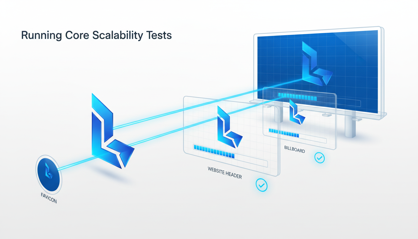
When it comes to logo design, scalability isn’t just a nice-to-have—it's essential for brand visibility. From a favicon at 16px all the way to a gigantic billboard, a scalable logo ensures your brand remains recognizable and impactful.
Favicon Size Testing (16px)
Key Insight: If your logo blurs into a blob at 16 pixels, it’s not serving your brand. A study by Custom Neon found that 75% of consumers recognize brands primarily by their logo, making legibility at small sizes crucial for quick brand recall.
Pass/Fail Criteria:
- Ensure legibility: The logo or symbol should be distinct and identifiable. If it looks like a smudge, it fails.
- Recognizability: Can someone familiar with your brand recognize it instantly?
- Contrast: Make sure the logo has sufficient contrast with its background.
Example Issue: Ornate fonts and detailed graphics often suffer here. Simplify your design by focusing on strong, geometric shapes as recommended by experts, which stay identifiable at small sizes.
Fix Map: If the logo fails at this size, use Quicklogo to generate alternative versions focusing on simplified shapes and optimize for favicon legibility. Quickly iterate and refine your design using Quicklogo’s built-in tools.
Header Size Recognition (250px)
Key Insight: A logo that’s clear and professional at 250 pixels can elevate a website header and boost brand presence online.
Pass/Fail Criteria:
- Detailing: Every element should be perceptible without squinting.
- Typography: Ensure text elements are clear and the font type remains legible.
- Spacing: Proper spacing maintains the integrity of the design.
Example Issue: Overly cramped designs with insufficient negative space often look cluttered. Adjust spacing to ensure elements aren’t fighting for attention.
Fix Map: Refine typography and spacing using Quicklogo’s customization options. Adjusting stroke thickness or font weight may enhance clarity.
Billboard Size Visibility (3000px+)
Key Insight: At billboard size, your logo needs to command attention and be instantly recognizable from a distance, reflecting the fact that 60% of consumers avoid brands with outdated or unappealing graphics.
Pass/Fail Criteria:
- Impact: Does your logo stand out from a distance?
- Balance: Ensure no part of the design overwhelms the others.
- Color Quality: Colors should remain vibrant and consistent.
Example Issue: Lack of balance where a logo feels overwhelmingly weighted to one side. This can make a billboard version less visually appealing.
Fix Map: Use Quicklogo to quickly iterate and adjust proportions and color settings. Scaling icons and text proportionally can resolve imbalance issues, ensuring that your logo makes the right impact.
By running these core tests and tweaking designs with Quicklogo, you can ensure your logo is scalable—avoiding costly reworks and enhancing your brand’s visibility from digital to physical spaces.
Handling Edge-case Scenarios
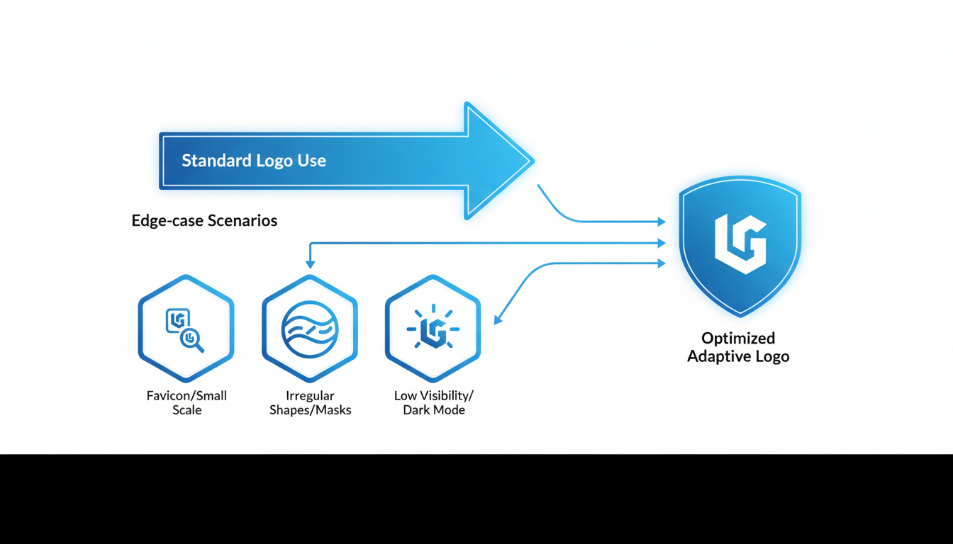
When it comes to ensuring your logo's scalability, handling edge-case scenarios is crucial. These are the situations that can unexpectedly impact your brand's visibility, such as dark mode usage, low-quality print, and the effects of distance and motion. Let's break down these scenarios and equip you with practical insights.
Dark Mode and Low-Quality Print
Key Insight: Your logo must maintain its integrity across various visual backgrounds, especially in dark mode and print settings.
With the growing adoption of dark mode across devices, it's vital to ensure your logo stands out against dark backgrounds. Conduct a logo contrast test by placing your logo against a dark backdrop. The goal is to guarantee that key elements like text and icons remain visible and distinctive. Consider these steps:
- Adjust Colors: Use colors with higher contrast. For icons, a light or white color often provides the necessary contrast.
- Simple Shapes: As suggested by design guidelines, use geometric shapes that remain identifiable in all settings. Avoid intricate details that could blur in darker modes.
When it comes to printing, low-quality print can degrade logo appearance. Test print your logo using reduced-quality settings to see how it fares. If details become muddy:
- Refine Lines: Increase stroke thickness on icons and text.
- Contrast Boost: Enhance color contrast to avoid blending in with the background.
Evaluating Distance and Motion Effects
Key Insight: Your logo should remain recognizable from a distance and in motion to facilitate effective brand recognition.
Logos often need to be visible from afar, such as on billboards or signage. This requires testing the logo's visibility from various distances. Set it against real-world scenarios to simulate this:
- Distance Test: View your logo from varying distances. If it becomes indistinct, consider simplifying elements or enlarging key features.
Motion, such as on animated digital ads, can impact logo clarity. When logos are seen briefly, robustness in design ensures they’re remembered. Evaluate motion effects through:
- Consistency Check: Keep key elements constant even when other parts animate.
- Bold Typography: Ensures readability during quick glances or motion transitions.
Real-world Examples of Logo Scalability Failures
Imagine a scenario where a logo looks stunning on a desktop website but is a mere blur on a mobile device's dark mode. This is not uncommon, as 60% of consumers avoid brands with unappealing logos, often due to poor scalability (source: Custom Neon).
Take Nike, for example: its swoosh icon is scalable and recognizable regardless of size or medium. This stems from its simplicity and strong contrast, underpinning why 75% of consumers recognize brands primarily by logos (source: Custom Neon).
By addressing these edge-case scenarios with strategic testing and adjustments, you ensure that your logo maintains its impact — whether it’s tiny on a favicon or large on a billboard. Quicklogo offers tools to generate multiple iterations swiftly, allowing you to test and tweak until your logo meets all unique constraints effectively.
Diagnosing and Fixing Scalability Issues
When your logo turns into an unrecognizable smudge at smaller sizes, it’s not just an aesthetics issue—it's a brand recognition problem that can impact your bottom line. So, how do you diagnose and fix these scalability issues? Let's dive into a systematic approach with a diagnosis-to-fix matrix.
Key Insight: Identify Symptoms and Causes
Symptom 1: Lack of Legibility
- Cause: Fonts that are too intricate or thin.
- Fix: Switch to bolder, sans-serif fonts that maintain clarity in small sizes. Test changes using Quicklogo's customization feature to quickly iterate new variations.
Symptom 2: Poor Recognition at Small Sizes
- Cause: Overly complex designs with multiple details.
- Fix: Simplify the logo by removing extra elements. Focus on core shapes and use bold contrasts. Use Quicklogo to generate simplified versions, streamlining the process.
Use of Stroke Thickness and Negative Space
Key Insight: Utilize proper stroke thickness and negative space to maintain balance and visibility across all sizes.
Stroke Thickness: Ensure your lines are neither too thin (which disappear at small sizes) nor too thick (which crowd the design). Aim for consistency in stroke application to provide balance. A useful rule of thumb is maintaining a minimum thickness that you test at favicon size.
Negative Space: Leverage negative space to enhance logo clarity and prevent clutter. This not only improves legibility but also emphasizes key elements of your logo. Effective use of negative space makes your logo pop without competing distractions.
“Design simple, versatile icons using geometric shapes that stay identifiable at small sizes, avoiding intricate details.” — Expert Design Guideline
Diagnosis-to-Fix Matrix
Here's a handy table to diagnose and resolve common logo scalability issues:
| Symptom | Possible Cause | Recommended Fix |
|---|---|---|
| Blurry Details at Small Sizes | Fine lines and intricate designs | Increase stroke weight; simplify elements |
| Loss of Recognition | Overly complex shapes/colors | Simplify design; enhance color contrast |
| Poor Contrast on Dark/Light Modes | Colors too similar in tone | Test color variations for better contrast |
| Cramped Elements | Insufficient negative space | Increase spacing; ensure clear separation |
Iterate with Quicklogo
Quicklogo offers a streamlined iteration loop: generate multiple options, select the best fit, customize to address issues, and retest. This flexibility helps you adapt quickly without starting from scratch, especially when you need that logo ready to deploy across diverse channels.
Remember, 75% of consumers recognize brands primarily by their logos. Ensuring your logo is scalable means keeping your brand in the spotlight wherever it may appear. With Quicklogo, you're not just creating a logo; you're building a robust visual identity that holds up from a tiny favicon to a towering billboard.
Rapid Iteration with Quicklogo
When it comes to ensuring your logo scales smoothly from favicon to billboard, Quicklogo is your go-to tool for rapid iteration. Here's how you can leverage its capabilities to validate your logo's scalability effectively.
Generate, Select, and Customize Logos
Quicklogo's AI-driven platform allows you to generate multiple logo options in seconds. This feature is perfect for early-stage startups who need to visualize various directions quickly and without hassle. Whether you're experimenting with different styles or testing specific elements like iconography and typography, Quicklogo offers a plethora of professional-quality logo variations. Simply input your business description, and let the tool produce designs tailored to your brand's aesthetic.
Once you have your options, the next step is selection. Pick the design that aligns best with your vision and start customizing it. Quicklogo's interface allows for easy adjustments—whether it's tweaking colors or adjusting stroke thickness—to ensure your logo remains legible and recognizable at any size.
Key Insight: According to experts, “Prioritize scalability and versatility... From app icons to billboards, scalability keeps your brand recognizable.” This customization phase is crucial, as it lets you fine-tune elements for optimal scalability across different media.
Retest Until Scalability is Validated
After customization, use Quicklogo’s flexibility to retest your logo at critical checkpoints like favicon (16px), header, and billboard sizes. The platform supports multiple repeats of this generate-select-customize cycle, helping you refine your design until it meets all pass/fail criteria for legibility, recognizability, contrast, and spacing. With Quicklogo's efficient iteration process, you can address any failures rapidly and effectively.
Highlighting Speed and Flexibility
Quicklogo stands out for its speed and flexible iteration loop. This tool not only enables you to generate and edit logos swiftly but also offers multi-format downloads—ideal for deploying your final design across digital and print platforms seamlessly. This comprehensive approach follows the industry trend of digital-first optimization and ensures brand consistency, ultimately contributing to a potential revenue boost of up to 23% through consistent logo use (Lucidpress).
By leveraging Quicklogo, you turn logo scalability from a daunting detail into a streamlined, manageable process—empowering non-designers and design-light teams to launch confidently.
Finalizing a Logo Scalability Kit
Creating a logo that not only looks fantastic on your website but also remains recognizable on a billboard is crucial for brand consistency. Let’s dive into how you can finalize a logo scalability kit that ensures your logo performs at every size.
Compile Variations and File Formats
Building a comprehensive logo scalability kit means curating the right variations and file formats. Your logo should transform seamlessly from an icon-only version for app icons to a full wordmark on larger platforms. Here’s your checklist:
Icon-Only Logo: Perfect for social media avatars and app icons where space is scarce. Ensure it stays recognizable even at the smallest sizes by using simple, bold shapes and avoiding intricate details. This echoes the advice to "design simple, versatile icons using geometric shapes," a crucial guideline for maintaining clarity.
Stacked and Horizontal Variations: Having both configurations enables flexibility across different platforms and layouts. For instance, a stacked logo might suit a square social media profile, whereas a horizontal version works well in website headers.
File Formats: Always have your logos ready in multiple formats: PNG for web, SVG for scalability, and EPS for print. This multi-format approach guarantees your logo is adaptable across digital and physical media.
Launch-Ready Checklist
Here’s a launch-ready checklist to ensure your logo is prepared to shine, whether as a favicon or a billboard:
Pass/Fail Testing: Utilize the three core tests discussed earlier—favicon, header, and large signage. Each size must be tested for legibility, recognizability, and contrast. Remember, 60% of consumers avoid brands with poor logos, underscoring the importance of these tests.
Consistency Check: Use tools like Quicklogo to maintain consistency across all platforms, a move that could boost your revenue by up to 23%, as noted by Lucidpress.
Formats and Variations: As mentioned, ensure all variations (icon, stacked, horizontal) and file formats (PNG, SVG, EPS) are included in your kit.
Linking Scalability to Business Impact
By ensuring your logo is scalable, you aren't just focusing on aesthetics—you're investing in business growth. Consistent branding through scalable logos keeps your brand recognizable and adds to consumer trust, influencing purchase decisions. According to research, consistent logo use can increase revenue by up to 23%. This highlights how vital it is to finalize your scalability kit before launch. For a streamlined process, try Quicklogo’s generate→select→customize workflow, which helps you make rapid adjustments without design expertise.
In summary, a well-prepared logo scalability kit can be your brand's best ally, enhancing recognizability and consistency, and ultimately driving business success.
Frequently Asked Questions
What is logo scalability and why is it important?
Logo scalability ensures your logo maintains legibility and recognizability across various sizes and formats, critical for brand visibility.
How can I test my logo's scalability?
Use defined pass/fail criteria at different size tiers, such as favicon, header, and billboard tests.
What should I do if my logo fails a scalability test?
Use a diagnosis-to-fix matrix to identify issues and make design adjustments, such as increasing stroke thickness or simplifying details.
How does logo scalability impact business growth?
Scalable logos contribute to better brand recognition and consistency, potentially boosting revenue by up to 23%.
Why use Quicklogo for logo iteration?
Quicklogo allows you to generate, customize, and download multiple logo options quickly, facilitating fast iteration and testing.
Key Takeaways
Ensuring your logo maintains its integrity from the smallest favicon to the largest billboard is vital for brand consistency and impact. Here’s a quick checklist to set your logo up for success:
- Create Variations: Develop multiple logo sizes and versions to suit different applications.
- Pass Scalability Tests: Ensure your logo looks great at all sizes and resolutions.
- Export in Multiple Formats: Prepare your logo in formats like SVG, PNG, and PDF for versatility.
By following these steps, and leveraging Quicklogo's powerful tools, you can validate and refine your logo’s scalability, ensuring it contributes to cohesive brand visibility and potential revenue growth.
Next, implement the test plan discussed, utilizing Quicklogo’s fast iteration capabilities to customize and perfect your logo. Lock in your final design with a consistent branding kit to drive recognition and capitalize on potential revenue lifts.
Visit Quicklogo to start refining your scalable logo today!
Back to all posts