

How to Design a Logo for Your Business Without a Designer
Discover a straightforward, founder-friendly approach to creating a professional logo without hiring a designer. From idea generation to consistent rollout, we guide you through the process using Quicklogo.
Quicklogo Team
How to Design a Logo for Your Business Without a Designer
In today's competitive landscape, having a logo that resonates with your audience is more crucial than ever. Yet, faced with tight budgets and a myriad of design choices, many first-time founders and SMB owners find themselves asking: How can I create a standout logo without hiring a designer? With 64% of CMOs struggling financially to fully execute their strategies and marketing budgets shrinking to 7.7% of revenue, finding efficient solutions has never been more pressing.
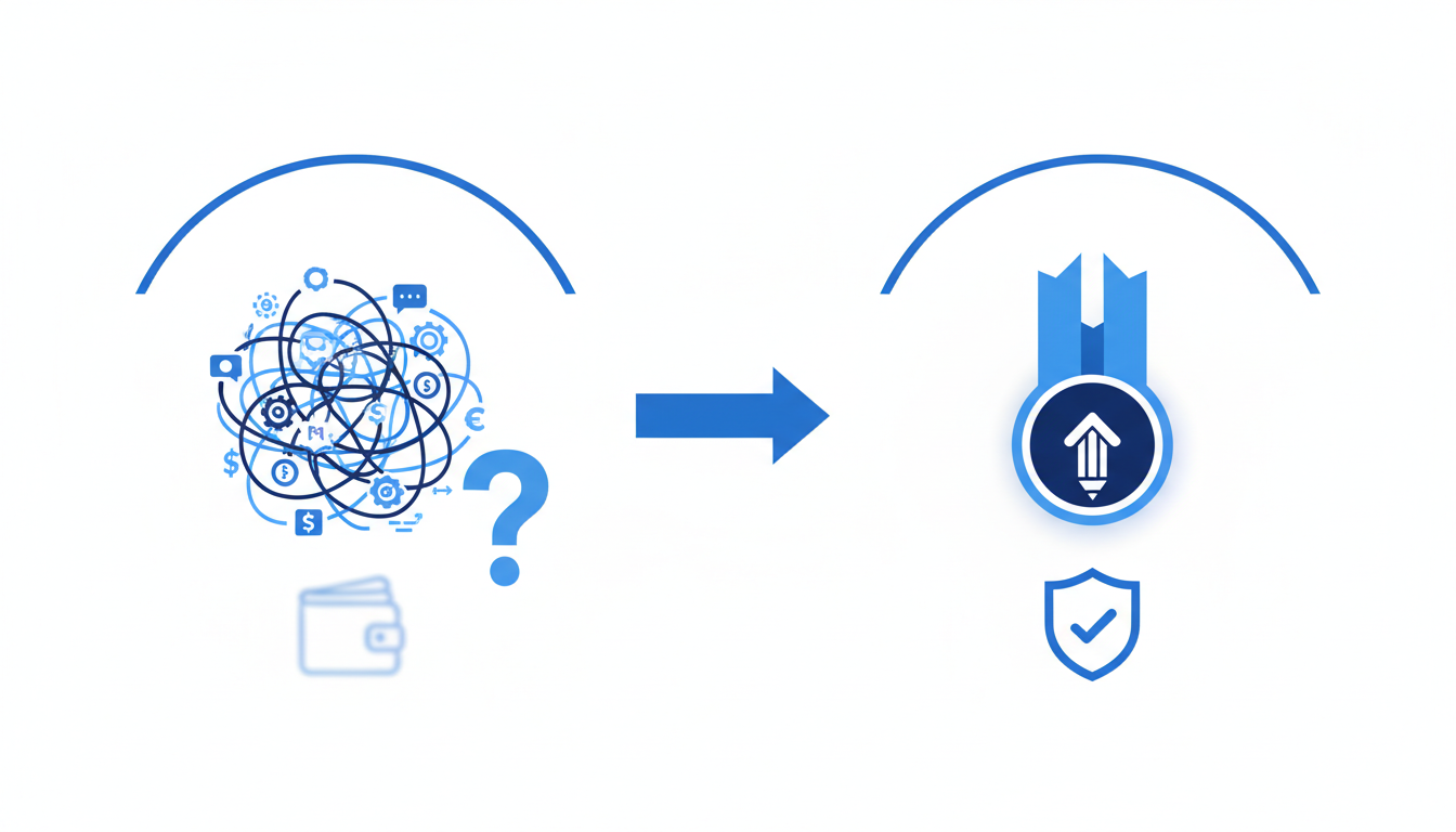
Enter Quicklogo — a revolutionary AI-powered tool tailored for those who need a professional logo quickly and without the design jargon. This post will guide you through a decision-first, founder-friendly workflow, helping you navigate the process from idea to deployment. You'll discover how to leverage AI to generate, compare, and refine multiple logo options, ending with a practical rollout plan that ties brand consistency to a potential 23% revenue increase. Say goodbye to generic, uninspired designs and explore a method that allows your brand to shine, tailored specifically for the challenges of 2025.
Introduction: The Need for a DIY Logo Approach
In today’s business landscape, balancing a tight budget with a need for strong brand recognition is more crucial than ever. With marketing budgets dropping to just 7.7% of overall company revenue in 2024, as noted by the Figma resource library, the pressure is on to make every dollar count. Simultaneously, 75% of consumers recognize a brand by its logo, according to Huddle Creative, making your brand mark essential to capturing attention and conveying professionalism.
The rise of AI tools offers a solution, particularly in logo design. An impressive 40% of small businesses are already leveraging AI-powered logo makers to create unique brand identities quickly and affordably. This trend is expected to increase by another 40% in 2025, highlighting the growing reliance on technology to streamline this critical aspect of branding.
Enter Quicklogo: a tool designed to meet the needs of founders and small businesses aiming to create a logo without a designer. Quicklogo enables you to generate a range of logo concepts in seconds, providing multiple professional options ready for immediate comparison. This fast, efficient approach helps avoid the common pitfalls of generic, sans-serif designs that have become prevalent with AI-driven logo creation.
By using Quicklogo, you can swiftly iterate on designs, ensuring your logo is not only quick to produce but also distinctive and tailored to your brand's personality. Its user-friendly interface supports solopreneurs who need to keep things simple yet effective, working within the constraints of both time and budget.
Quicklogo's standout feature is its ability to deliver fast, high-quality outputs, making it a go-to for anyone in need of a DIY logo solution. This tool is not just about speed; it’s about equipping you with the power to make savvy, business-first design decisions—your logo will be ready to launch and strong enough to grow alongside your venture.
Step 1: Defining Success and Constraints
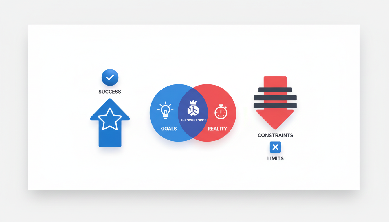
Creating a logo without a designer might sound daunting, but it begins with a clear understanding of what makes a logo "good enough" to launch. This boils down to practicality, resonance with your target audience, and alignment with your brand's identity.
What Defines 'Good Enough'?
A logo isn’t just a pretty picture—it’s the visual heartbeat of your brand. For a small business owner, the goal is to craft a brand mark that quickly communicates what your business stands for. Remember, 75% of consumers recognize brands by their logos, and 60% actively avoid those that look outdated or unappealing (Huddle Creative).
Keep your initial logo simple yet versatile—it should work across various platforms like websites, social media, and print. Simplicity ensures it’s memorable, while versatility means it can be easily modified as your business grows.
Navigating Constraints
When defining success, it’s essential to acknowledge constraints like budget and audience. With marketing budgets dropping to 7.7% of overall revenue (Figma), finding cost-effective solutions is crucial. Using tools like Quicklogo allows you to generate a logo without the typical designer fees, making it ideal for solopreneurs or startups.
Your target audience will also shape logo decisions. Consider their preferences—do they favor bold and modern, or classic and understated? This insight helps guide both design elements and color choices, particularly since 80% of people say color plays a vital role in brand recognition (Huddle Creative).
The Mini-Brief Template
Before diving in, take a moment to craft a concise mini-brief. This document acts as a roadmap, focusing your efforts and ensuring alignment with your brand's goals:
Business Overview: What does your business do?
Core Values: What do you stand for?
Target Audience: Who are you reaching out to?
Style Inspiration: Are there brands or aesthetics you admire?
Success Indicators: What does a successful logo help you achieve?
Gathering these insights will streamline the creation process, aligning each design decision with your business objectives. By clearly defining what success looks like and understanding your constraints, you're well-equipped to create a logo without a designer that's “good enough to launch” and “strong enough to grow.”
Step 2: Gathering Inputs for a Strong Foundation
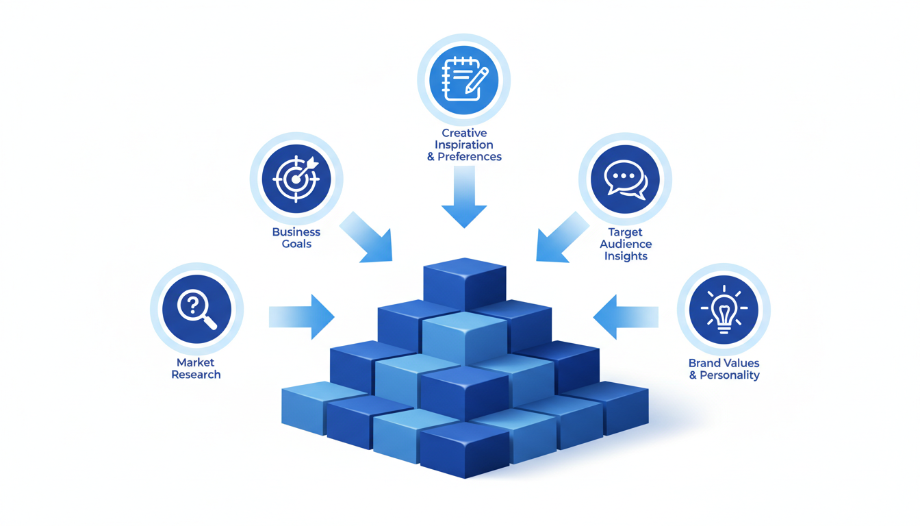
Creating a compelling logo without a designer involves setting a solid foundation. This foundation consists of understanding your audience, examining your competitors, and defining your brand's personality. Let's dive into how you can efficiently gather these inputs, ensuring your logo resonates with your target market.
Understand Your Audience
The first step is to know who you’re designing for. Your audience should guide the overall feel and direction of your logo. Ask yourself questions like:
Who are your ideal customers?
What are their values and preferences?
For instance, if your audience primarily consists of young adults interested in tech, a modern and sleek logo might resonate well. Research suggests that 75% of consumers recognize a brand by its logo, so aligning it with audience preferences is crucial.
Examine Your Competitors
Next, scrutinize your competitors. Understanding the logos within your industry can highlight both opportunities and pitfalls. Look for:
Common themes and colors in competitors' logos.
Elements that seem overused.
This step is vital in ensuring your logo stands out. With 60% of consumers avoiding brands with outdated logos, ensuring uniqueness while maintaining simplicity is important. Avoid replicating generic trends, such as the wave of sans-serif logos driven by AI as noted by trend reports.
Define Brand Personality
Now, translate your brand’s mission and vision into key adjectives. Are you bold and adventurous, or calm and trustworthy? These adjectives should guide your design choices. Consider:
Selecting 3-5 adjectives that best describe your brand’s personality.
Using these adjectives to influence your color palette and icon choices, critical for brand recognition as 80% of people say color plays a key role.
Keep It Concise
Efficiency is essential, especially if you're a busy founder. Set a timer for 60 minutes to gather all these inputs. This ensures focus while pushing you to make quick, decisive choices.
By gathering these insights, you're not just tossing things at the wall to see what sticks; you're making informed decisions, which is exactly what Quicklogo’s approach facilitates: generating professional options quickly using your brief. This foundation sets the stage for creating a logo that’s not only "good enough to launch" but capable of growing with your brand.
Step 3: Choosing the Right Logo Type and Colors
When designing a logo without a designer, the foundation begins with selecting the right logo type. This choice sets the tone for how your brand will be perceived, so let's break down your options:
Wordmarks: These logos consist solely of your company name styled with unique typography. This approach is perfect for businesses aiming for simplicity and high recognition since the name is the focal point. Think Google and Coca-Cola. If your brand name is catchy or distinct, a wordmark could be your best bet.
Icon Marks: These are more abstract symbols that represent your brand. They work well for versatile usage across different media. Consider brands like Apple—an iconic logo that communicates their brand without words. An icon mark is ideal if your business seeks a strong visual identity that stands alone.
Combination Logos: As the name suggests, this type blends a wordmark with an icon, offering flexibility. You can use the combo for brand identity and separate them for different marketing campaigns. Think of brands like Adidas; the logo works whether the text or the icon appears.
Choosing the right logo type relies heavily on your brand’s identity and goals. Once you've picked your type, it’s time to dive into color selection.
Color is crucial for brand recognition. According to Huddle Creative, a remarkable 80% of people say color plays a key role in brand recognition. This means your color palette should extend beyond personal taste—consider how colors will resonate with your audience:
Red evokes excitement and passion and can grab attention immediately.
Blue exudes trust and professionalism, making it a common choice for tech firms.
Green suggests peace and growth, often used by environmentally-friendly brands.
Creating a color palette involves selecting primary and secondary colors that can maintain consistency across various applications. Always test how colors appear in both digital and print formats to ensure they align perfectly.
In short, aligning your logo type and color with your brand identity forms the backbone of your logo's effectiveness. By understanding the nuances of these elements, you give your brand a clear, distinct identity that resonates with your audience.
Step 4: Crafting a Compelling Logo Brief
A well-crafted logo brief is the foundation of effective logo creation, particularly when you're not enlisting the help of a designer. It guides the AI in producing options that align with your business's identity. Here's a simple guide to writing a precise and effective logo prompt.
Begin with the Essentials: Start by summarizing your business core—what you do, who you serve, and what makes you unique. This helps the AI focus on your distinct brand attributes. For example:
Business Description: “We are a family-owned bakery known for our artisanal, organic bread and pastries.”
Target Audience: "We cater to health-conscious, urban dwellers who appreciate quality and tradition."
Defining Your Brand's Personality: Use adjectives to articulate your brand personality—are you playful, elegant, modern, or traditional? This characterization steers the design tone.
Personality Adjectives: “Warm, authentic, and wholesome.”
Incorporate Visionary Elements: Think about potential elements or symbols that resonate with your audience or values. While not mandatory, they can spark creative directions.
Symbol Ideas: “Consider using wheat sheaves or a vintage rolling pin to emphasize tradition and quality.”
Leverage Quicklogo for Efficient Input: Quicklogo makes inputting these elements a breeze. Simply navigate to the prompt section, and with a few concise details, set the stage for diverse output possibilities.
Here's how the AI logo maker feature at Quicklogo plays a pivotal role:
Diverse Options: By feeding in this clear, concise brief into Quicklogo, you prompt the AI to generate a broad range of professional logo concepts tailored to your inputs.
Instant Comparisons: Quicklogo’s ability to create numerous options within seconds means you can quickly compare designs side-by-side, exploiting Quicklogo’s strength in fast, iterative decision-making.
The result? A spectrum of logos that genuinely reflects your business ethos. Always aim for clarity and precision in your brief to maximize the effectiveness of the AI design process—a critical step in building a “good enough to launch, strong enough to grow” brand mark.
Expert Tip: Simplicity and clarity are your allies. An explicit, well-structured brief enhances creativity without cluttering the design process.
Step 5: Generating and Comparing Unlimited Options
Creating a remarkable logo without a designer requires a tool that offers flexibility and efficiency. Enter Quicklogo, an AI logo maker designed to help you generate multiple options in seconds. Here, we'll dive into how you can leverage Quicklogo for swift, side-by-side comparison to identify the perfect logo for your business.
When using Quicklogo, the process is simple yet effective. You'll start by providing a concise description of your business, which the AI uses to generate a wide array of logo concepts. This rapid generation is a game-changer for first-time founders and small business owners, allowing you to see diverse professional outputs without waiting days or weeks.
Why Choose Quicklogo for Logo Generation?
Speed and Efficiency: Quicklogo's AI generates logos in seconds, negating the long wait and high costs associated with traditional design processes.
Variety and Professional Quality: You receive multiple professional options at once, which is ideal for visualizing different angles and inspirations for your brand mark.
Time-Saving and Cost-Effective: Eliminating the back-and-forth with designers saves precious time and trims budgets, fitting perfectly into constrained marketing allocations that have seen cuts to just 7.7% of revenue (source: Figma).
The Side-by-Side Advantage
One of the standout features of Quicklogo is the ability to compare these options side-by-side. This comparison helps in rapidly identifying which logo best aligns with your brand's vision and personality. Here’s a simple markdown table outlining the benefits:
Feature | Quicklogo | Traditional Design |
|---|---|---|
Speed | Generates in seconds | Days to weeks |
Cost | Credit-based, cost-effective | Expensive per-design fees |
Variety | Multiple options in one go | Limited by designer capability |
Comparison | Instant side-by-side comparison | Not typically offered |
Customization | Built-in options available | Requires back-and-forth |
Expert Insight: "The ability to generate and compare multiple options side-by-side is crucial in building a distinctive, scalable logo without falling into the trap of generic sans-serif designs prevalent in 2025."
With Quicklogo, you can quickly iterate on these AI-generated concepts, ensuring your logo maintains the uniqueness needed in a crowded market. By employing a decision-first framework, you're not just picking what looks good; you're selecting a logo that's "good enough to launch, strong enough to grow."
Leveraging this approach allows you to turn a daunting task into a manageable, strategic step in your business’s branding journey. For even faster iterations, check out our How to Launch a Logo Today: A Step-by-Step Guide Using Quicklogo.
Step 6: Narrowing Down Using a Logo Scorecard
Now that you've generated multiple logo options using Quicklogo, it's time to zero in on the best candidate with a logo evaluation scorecard. This method goes beyond personal taste and equips you with a structured way to assess each logo’s potential as a key part of your brand identity.
Template Scorecard for Scoring Logos
Begin with a simple scorecard that highlights three core areas: functionality, memorability, and scalability. Rate each logo on a scale of 1 to 5 in these categories, helping you focus on business-critical aspects rather than aesthetics alone.
Functionality: How well does the logo convey your brand’s purpose or product? A good logo should be simple yet illustrative enough to communicate what your business is about at a glance. For example, if your company specializes in eco-friendly products, does the logo incorporate elements that reflect sustainability?
Memorability: Consider the logo’s uniqueness and how easily it can be recalled. With 75% of consumers recognizing brands by their logo (Huddle Creative), memorability is crucial. A logo that stands out will stick in your audience’s minds and foster brand recognition.
Scalability: A logo needs to maintain its clarity and visual appeal across various sizes and formats. Whether it’s displayed on a tiny favicon or a large billboard, the scalability of your logo is essential. Ensure it adheres to expert tip guidelines: using vector formats and maintaining proportional clear space around it.
Emphasizing Decision-Making Over Personal Taste
By focusing on these attributes, you prioritize your brand’s strategic needs. A logo that ranks high across these categories is more likely to drive brand consistency and recognition long-term—key contributors to the 23% revenue increase linked to consistent logo usage (Huddle Creative).
Remember, selecting a logo isn’t about falling in love with a design; it’s about choosing the one that best serves your business goals.
Once you've scored the options, shortlist the top three to iterate further. This evaluation technique not only ensures a strong start but sets the tone for a logo that can grow with your brand.
Next, move to Step 7, where we'll refine your selections to counter 2025’s trend of generic AI-driven designs.
Step 7: Iterating to Avoid Generic AI Trends
In 2025, the rise of AI-powered logo makers has led to a flood of generic logos, particularly those leaning heavily on sans-serif fonts and minimalistic designs. While simplicity and clarity are key, your logo should also stand out to avoid blending into the sea of sameness. Here’s how to iterate effectively to keep your logo distinctive yet simple.
Start by leveraging Quicklogo’s AI capabilities to generate a variety of options quickly. This way, you gain a broad view of potential directions before zeroing in on your ideal design. Once you have these base concepts, it’s time to apply a more personal touch.
1. Custom Typography: While sans-serif typefaces are popular for their legibility, integrating a custom typeface or modifying an existing one can add a unique flair to your wordmark. Subtle changes in letter spacing, the thickness of lines, or even tweaking individual letters can create a signature look that stands out while maintaining readability.
2. Iconography with Purpose: Incorporate an icon mark that resonates with your brand’s core values or industry. Look for symbols that aren't overused in your industry. For instance, if you’re in tech, instead of the usual circuit or pixel patterns, perhaps consider imagery that speaks directly to your unique service or audience.
3. Color Pop: Since 80% of people say that color enhances brand recognition, choose a color palette that reflects your brand personality. Use contrasting colors to make elements pop or a monochromatic scheme for sophistication. Add your primary brand color, such as Quicklogo’s #2383E2 blue, for distinctiveness across different media.
4. Texture and Depth: With everyone leaning toward flat design, incorporating slight textures or shadows can add depth without complicating the design. A simple shadow or gradient can transform a flat icon into something more memorable.
Keep iteration in your workflow by revisiting the logo after feedback — whether from initial users, colleagues, or through a logo evaluation scorecard. This step ensures your logo isn’t just a cookie-cutter output from an AI logo maker but a personalized, strategic mark that tells your brand story effectively.
These anti-generic tactics will ensure your logo is not only ready to launch but also strong enough to grow your brand recognition in a crowded marketplace.
Step 8: Quality Assurance for Versatility and Scalability
Creating a logo that’s both versatile and scalable is crucial for maintaining brand consistency across various mediums. Here’s how to ensure your logo is up to the task:
Importance of Clear Space and Vector Formats
First things first, let's talk about clear space. Clear space is the area surrounding your logo that should remain free of any other text or graphics. It ensures your logo is always visually distinct and not lost in a clutter of competing elements. Imagine your logo as a framed piece of art—without the frame, it gets lost on the wall. This principle helps maintain the integrity and impact of your brand mark, whether it’s on a website banner or a business card.
Equally essential is using a vector logo format. Unlike raster images, which can pixelate when scaled up, vector files (such as SVG or EPS) ensure your logo remains sharp and clear at any size. This scalability means your logo will look just as crisp on a billboard as it does on a website favicon. Using vector formats also allows for easier editing and color adjustments without compromising quality.
Checklist for Versatility Across Mediums
To ensure your logo works across different platforms and applications, keep the following checklist handy:
Color Variations: Does your logo have both a full-color and a monochrome version? Having these variations ensures it remains visible against differently colored backgrounds.
Size Adaptability: Can your logo be resized without losing detail or recognizability? Ensure it works at both small sizes (e.g., mobile screens) and larger formats (e.g., posters).
Readability: Is your text legible at all sizes? Ensure any typography used in the logo maintains clarity even at the smallest sizes.
Background Options: Test your logo against light and dark backgrounds to confirm its versatility.
Importance of Scalability for Brand Consistency
Brand consistency is vital; it leads to a reported 23% revenue increase with consistent logo use across platforms (Huddle Creative). A scalable logo is the backbone of this consistency. By ensuring your logo remains impeccable at any dimension, you emphasize reliability and professionalism in your brand's visual communication.
By adhering to these quality assurance principles—prioritizing clear space and vector formats, following a rigorous checklist, and ensuring scalability—your logo will maintain its impact and identity, no matter where it appears. This level of preparation ensures that your brand stands out, resonates with your audiences, and supports your business growth effectively.
Step 9: Exporting and Organizing Logo Files
After creating a logo that captures your brand's essence, it’s crucial to export and organize your files meticulously for easy access and consistent use. Let's dive into ensuring your logo is versatile across various platforms.
Start with Essential File Formats
When exporting your logo, it’s important to consider both digital and print needs. Key formats include:
PNG: Ideal for web use due to its transparent background, making it perfect for websites and social media.
JPEG: Useful for presentations and non-transparent use cases.
SVG: A vector format ensuring your logo remains crisp and clear, regardless of size. This is essential for scalability.
PDF: Perfect for print materials, retaining high-quality for brochures or business cards.
Quicklogo simplifies this process by delivering your logo in multiple formats suitable for both digital and print applications. This versatility ensures your brand looks sharp on a business card, website, or billboard.
Organize Your Files Systematically
Keeping your logo files organized will save you time and stress in the long run. Here’s a simple method:
Create a Dedicated Folder: Label it clearly (e.g., "[YourBrand] Logos") to avoid confusion.
Subfolders by Format: Inside, separate your files by format (PNG, JPEG, SVG, PDF), so you quickly find what you need.
Version Control: Name files with specific details (e.g., "Logo_2025_Transparent") to differentiate easily as you iterate over time.
Metadata for Quick Identification
Save your logo files with metadata tags. This may include the logo’s creation date, version, and intended use (web, print). This makes it easier to search through your digital archives when needed.
A well-organized file system not only aids in easy access but also ensures brand consistency whenever your logo appears in public view, contributing to that impressive 23% revenue increase linked to consistent logo use across platforms.
Step 10: Consistent Deployment Across Platforms
Achieving brand consistency is crucial for both recognition and revenue growth. Statistics show a significant 23% revenue lift when businesses maintain consistent logo use across platforms (Huddle Creative). Here's how you can deploy your logo effectively to reap these benefits.
Why Consistent Deployment Matters
A logo serves as the face of your brand, offering a visual cue that customers associate with your business's values and promises. Consistency helps reinforce this connection. According to Huddle Creative, 75% of consumers recognize brands by their logos, and 60% avoid brands with outdated or unappealing visuals. By deploying your logo consistently, you ensure your brand is both recognizable and trusted.
Deploying Your Logo: A Step-by-Step Guide
Gather Your Logo Files: Make sure your logo is available in multiple formats—such as PNG for digital use and vector formats like SVG for scalability in print. Quicklogo provides these options to ensure your logo looks sharp on every platform.
Define Key Touchpoints: Identify where your logo will frequently appear—website headers, social media profiles, email signatures, YouTube banners, merchandise, and business cards. Each platform may require a different file format or size.
Create Platform-Specific Variations: Develop variations of your logo to fit different spaces, including a favicon for web browsers and an app icon for mobile devices. Remember, clear space around the logo is essential. Use proportionate padding to maintain its impact and readability.
Implement a Style Guide: A style guide ensures all team members use the logo correctly. Include guidelines for color schemes (remember, 80% of people say color plays a key role in brand recognition), minimum sizes, and proper clear space around the logo.
Regular Audit and Updates: Perform regular audits to ensure your logo is deployed consistently. Updates should align with new brand initiatives or platform requirements but maintain core brand integrity.
"Ensuring scalability is critical," as experts recommend. Use vector formats and add proportional clear space for consistency.
Leveraging Quicklogo for Consistency
Quicklogo simplifies the deployment process with its ability to generate multiple format outputs quickly. It allows you to refine and adjust logo elements to match each platform’s needs, ensuring you don’t compromise on quality or clarity. Consistent application across all touchpoints not only enhances brand recognition but also supports a professional image that resonates with consumers.
By following these steps and leveraging the right tools, you position your business to make the most of your branding efforts. This method of consistent deployment can transform your logo into a powerful ambassador for your business across both digital and physical spaces.
When to Consider Hiring a Designer
Navigating the world of logo design can be a rewarding DIY adventure, but there are moments when seeking professional expertise is worthwhile. Let's delve into when hiring a designer makes sense, especially if your business needs become more complex.
Complex Needs and Brand Identity
When your brand demands a uniquely intricate or innovative visual identity that can't be captured with basic logo tools, a professional designer's touch might be essential. For example, if you're launching a luxury fashion line or a tech startup with a unique positioning, a designer can create a custom, subtle storytelling element in your logo.
Cost-Benefit Analysis: DIY vs. Designer
Let's break down the cost-benefit scenario. With Quicklogo, you get a logo quickly, ideal for fast-paced launches or MVP tests. It's perfect for when you're constrained by time and budget—a key factor when marketing budgets have dropped to 7.7% of company revenue (Figma). Quicklogo's approach—generate, compare, iterate—aligns with this need, especially since 75% of consumers recognize brands by their logo (Huddle Creative).
However, if your brand evolves or faces diverse cultural markets, a designer who understands these nuances can craft a logo that resonates deeply, potentially providing a higher return on investment long-term. This is crucial for capturing the 80% of people who say color and design play a key role in brand recognition (Huddle Creative).
Evolving Business and Rebranding
Think about future-proofing your brand. If you anticipate a significant scaling up or rebranding, consider consulting a designer. Quicklogo provides an excellent launchpad, giving control for initial phases and avoiding the generic trend, especially noted in 2025 with AI-driven designs. Yet, as you grow, a designer can refine your logo for new challenges, ensuring it remains memorable and impactful.
Key Takeaway: Begin with Quicklogo for a cost-effective, fast solution. Hire a designer when your brand requires distinct creative expertise or you're ready to tackle complex market challenges.
Frequently Asked Questions
Can I create a professional logo without a designer?
Yes, using tools like Quicklogo, you can generate professional logos fitted to your brand needs.
Why avoid generic AI logos?
Generic logos can make a brand indistinct, reducing recognition and impact.
What files are needed for my logo?
You typically need vector files for versatility and high-res PNGs for digital use.
How can I maintain brand consistency?
Use the same logo across all platforms and adhere to the brand guidelines.
Why use Quicklogo over other services?
Quicklogo offers fast generation, professional options, and flexibility without needing design expertise.
Final Thoughts
Designing a logo without hiring a designer can be a streamlined, effective process with the right strategy. By following the loop of brief → generate → score → iterate → QA → deploy, you can efficiently create a logo that not only represents your brand but also contributes to a 23% revenue increase through consistent use, as noted by Huddle Creative.
To get started, use Quicklogo to generate 20–40 logo options, shortlist the top three, and run them through a QA checklist. Once you've selected your final design, roll it out consistently across all key touchpoints to maximize brand recognition. Consistent deployment is key, so let Quicklogo guide you through this innovative and time-saving journey.
For more, visit Quicklogo and explore its AI-powered logo creation for your business needs.
Back to all posts