

How to Customize an AI Logo After Generation in Quicklogo
Discover a step-by-step process for refining your AI-generated logo with Quicklogo. Improve clarity and consistency for a polished brand image.
Quicklogo Team
How to Customize an AI Logo After Generation in Quicklogo
Your AI-generated logo is 80% there, but that final 20% can make all the difference. Instead of feeling stuck with a design that almost but not quite fits your brand, imagine a step-by-step playbook guiding you through high-impact edits. Welcome to your non-designer’s guide to refining AI logos, tailored to Quicklogo’s customization workflow.
In this post, we’ll break down the essential micro-decisions—contrast, spacing, and typography consistency—that turn a good AI output into a purposeful brand asset. You’ll learn how to navigate Quicklogo’s speed-first interface, deciding when minor edits suffice or when regeneration is the smarter move. By the end, you’ll be equipped to make your logo look sharp and intentional across all platforms in under 30 minutes. Let’s dive in and finish that logo with confidence!
Introduction to Logo Customization
Creating a logo with AI tools like Quicklogo is an exhilarating first step towards defining your brand's visual identity. But to truly make the logo your own, customization is key. Understanding the importance of clarity and consistency can transform a good logo into an exceptional one that reflects your brand's personality and vision.
The Importance of Clarity and Consistency in Logos
Logos are often the first point of contact between your brand and potential customers. Ensuring your logo is clear and consistent across various applications is crucial. A well-customized logo should be easily recognizable and convey the right message, whether it's displayed on your website, social media, or promotional merchandise. For brands aiming for professionalism and trust, a consistent logo acts as a reassuring presence that strengthens brand recognition over time.
Challenges with AI-Generated Logos
AI logo generators like Quicklogo have democratized design by allowing anyone to create logos in seconds. However, these tools can sometimes result in logos that feel a bit generic or slightly off-brand. This is because AI, despite its sophistication, doesn't inherently know your brand's subtleties or history. Issues like awkward spacing, mismatched colors, or styles that don't quite align with your brand ethos can arise. That's where thoughtful customization comes in, allowing you to make high-impact, micro-decisions that truly tailor the logo to your unique brand.
Overview of Quicklogo's Customization Process
Quicklogo offers a seamless customization process optimized for speed without sacrificing depth. After generating multiple logo options tailored to your input, Quicklogo allows you to delve into the logo editor online where you can fine-tune your selection. This phase is crucial for transforming an editable logo into one that perfectly aligns with your brand's identity.
Here’s a quick walkthrough of Quicklogo’s customization process:
Choosing the Right Base: Start by picking the logo concept that best represents your brand. This foundational choice will define your direction.
Adjusting Spacing and Layout: Ensure the elements of your logo are well-balanced. Proper spacing is key to enhancing readability on different platforms, making it look professional and polished.
Typography Matters: Typography plays a big role in how your brand is perceived. Quicklogo allows you to experiment with different fonts to find what best expresses your brand’s voice, be it bold, playful, or sophisticated.
Color Customization: Colors are powerful communicators of emotion and brand identity. Use Quicklogo’s tools to adjust the palette to reflect your brand’s character, ensuring the result is both vibrant and legible.
Clarity at Small Sizes: The logo must remain distinct and clear even when scaled down. A well-customized logo will be legible on anything from large banners to tiny app icons.
By treating customization as a series of purposeful decisions rather than arbitrary tweaks, you can ensure that your logo not only stands out but is also a true reflection of your brand. If you're keen on exploring more elaborate workflows, check out How to Generate a Logo Online with Quicklogo (Step-by-Step Guide) for an in-depth understanding of the process.
Remember, Quicklogo’s strength lies in its ability to generate and refine logos quickly, perfect for those on tight timelines looking to make a lasting impression.
Setting Up: Brand Essentials & Decision Points
When you're diving into logo customization with Quicklogo, defining your brand essentials is your first high-leverage move. Knowing your brand colors, desired style, and tone helps ensure the logo fits your overall identity. Imagine you're laying the foundation for your visual brand—elements like colors, typography, and symbols are your building blocks.
Define Your Brand Basics
Start by answering a few simple questions:
Brand Colors: What primary colors represent your brand? If you're not sure, think about the emotions or messages these colors would convey. Quicklogo allows you to input and tweak your color palette. Opt for high-contrast combinations to ensure logo visibility across various channels, like web headers and social media.
Typography: Which font styles resonate with your brand voice? Are they modern, traditional, or playful? Consistency in typography across all media reinforces brand identity. Quicklogo makes it easy to adjust font style, size, and weight for better readability.
Brand Symbols: Is there a particular icon or symbol that encapsulates your brand's ethos? Consider its scalability because logos need to work from business cards to billboards.
Pro tip: Think long-term—your logo should be flexible enough to support both current and future brand evolution.
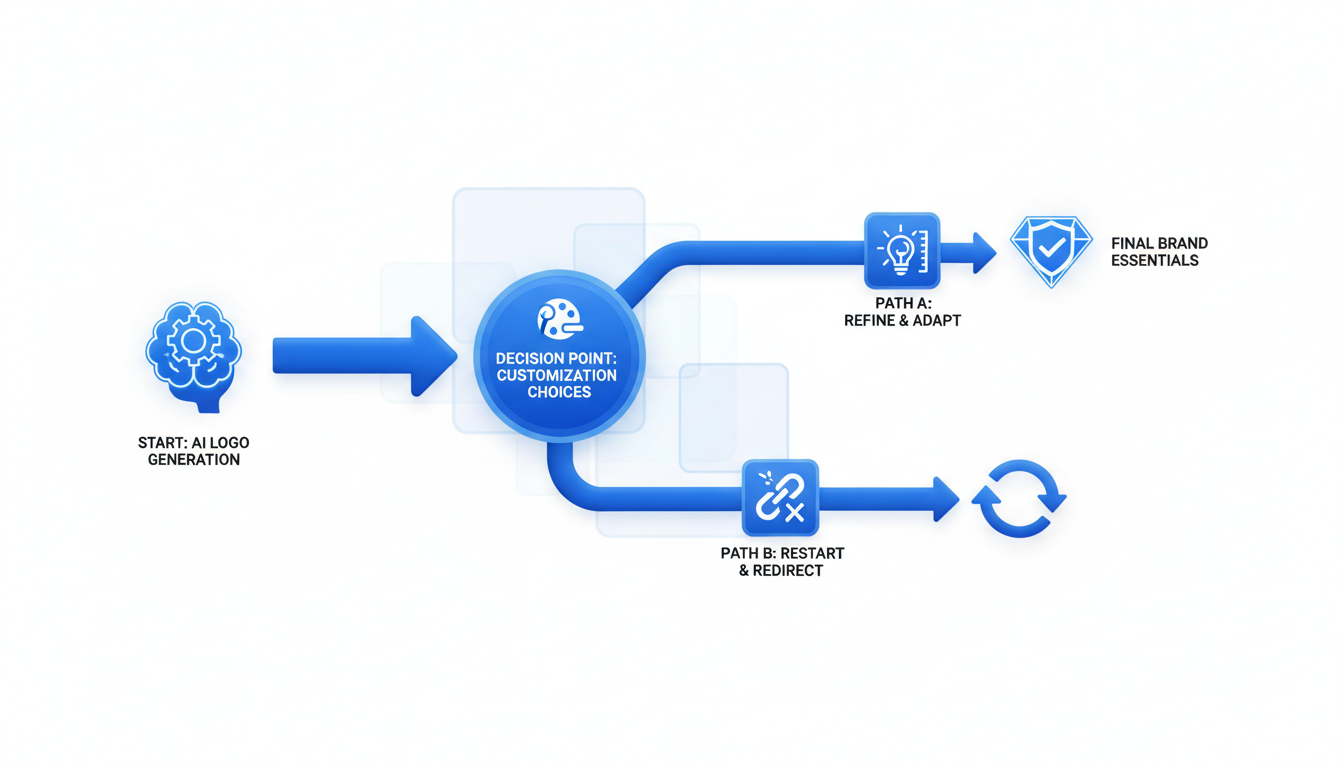
Understand When to Edit vs. Regenerate
Sometimes a generated logo is almost there, but not quite. Here's where the edit vs. regenerate decision tree comes into play:
Edit if:
- You like the overall concept but need minor tweaks (e.g., color adjustments or font style changes).
- The logo meets your brand’s tone but lacks some consistency.
- The icon or layout is perfect, but the typography or contrast needs fixing.
Regenerate if:
- The logo feels off-base entirely or mismatched with your brand vibe.
- You find it hard to read at smaller sizes, even after tweaking font settings.
- The colors and symbols are wrong for your brand, requiring more than minor changes.
Decision Tree Example:
| Situation | Action |
|---|---|
| Concept is right, just needs tweaks | Edit |
| Brand vibe doesn't fit | Regenerate |
| Minor color or font inconsistency | Edit |
| Poor legibility at all sizes | Regenerate |
Make these choices thoughtfully to ensure your logo doesn’t just look good at a glance but also serves its function across platforms.
Introduction to the Decision Tree
Customizing your logo is about making purposeful decisions that align with your brand goals. The decision tree acts as a checkpoint system, helping you decide whether to invest time in edits or start fresh with regeneration.
Edits offer polish: Fine-tuning colors, adjusting font weights, or refining spacing can transform an almost-there logo into a brand-ready asset.
Regeneration provides new perspectives: If the logo concept isn't coming together, generating new options may reveal paths you hadn’t considered.
Remember, each customization action in Quicklogo is designed to be intuitive, leveraging AI’s speed and your branding acumen. By focusing on clarity, consistency, and scalability, you elevate your logo from a basic design to a strategic brand element.
Step 1: Selecting a Base Concept
Your AI logo is 80% there, but the real magic happens in selecting the right base concept to refine. This step is all about evaluating the logo variants that Quicklogo presents, aligning them with your brand's aesthetics, and setting a strong foundation for customization. Think of it as choosing the frame for your art—everything else builds from here.
How to Pick the Right Logo Variant
Start by examining the options Quicklogo generates for you. Here, you’re looking for a design that resonates with your brand’s identity. Consider the following:
- Brand Mood: Does the logo capture the essence of your brand? Whether it’s modern and sleek or friendly and approachable, align the mood with how you want your audience to perceive your business.
- Iconography Relevance: Choose an icon that represents your industry or core values. For instance, a tech startup might prefer a geometric, abstract design, while a bakery might go for something that hints at the culinary.
- Uniqueness and Memorability: Aim for a variant that’s not only unique but also memorable. Something that stands out can create a stronger brand recognition over time.
Key Insight: “Selecting a logo that visually resonates with your brand identity ensures the foundation of your branding efforts is strong and purposeful.”
Evaluating Iconography and Style
Once you’ve shortlisted potential designs, dive into the details of iconography and style:
- Scalability: Ensure the logo maintains clarity across different sizes—be it a website header or on business cards. Simplicity often aids scalability.
- Versatility: Consider designs that are versatile across different mediums. A logo that looks good both in color and in black and white often provides more flexibility.
- Consistency with Branding: Ensure the style matches your existing brand elements. It should be cohesive with your color schemes and typography, creating a seamless visual narrative.
Aligning with Brand Aesthetics
Finally, check how each logo variant aligns with your overall brand aesthetics:
- Color Palette Harmony: Does the color align with your existing brand palette? Quicklogo allows you to tweak colors, but starting with a close match saves time.
- Typography Fit: Ensure the typography complements your brand voice. Is it professional, playful, modern, or classic?
Remember, if none of the variants seem right, it might be better to regenerate rather than spending time on heavy edits. This decision can save effort and align better with Quicklogo’s efficient workflow.
By selecting a base concept that fits your brand’s story, you set the stage for effective customization, ensuring your logo doesn’t just look good, but looks intentional and aligns with your brand vision.
Step 2: Adjusting Layout and Spacing
Your AI-generated logo is nearly there, but getting the layout and spacing just right can make a world of difference in its effectiveness and appeal. Let’s explore how to fine-tune these elements to enhance logo legibility and create balanced layout variations that elevate your brand.
The Role of Spacing in Readability
First, understand that spacing isn't just about aesthetics—it's crucial for readability. Proper spacing between text and iconography ensures that your logo stays clear and decipherable, even at smaller sizes. A well-spaced logo avoids clumping and crowding, helping each element breathe and be understood quickly.
Expert Tip: "Consistent spacing turns a good design into a great one by enhancing readability and focus."
Tips for a Balanced Logo Layout
A harmonious layout not only looks professional but also conveys your brand’s identity effectively. Here’s how to achieve it:
Hierarchy Matters: Ensure your layout clearly reflects the importance of each element. For instance, your brand name should take precedence if it’s more recognizable than the icon.
Alignment: Utilize alignment guides in Quicklogo to keep elements centered or intentionally offset, which can add visual interest without compromising harmony.
Balance: Symmetrical layouts offer a classic look and feel, while asymmetrical ones can convey a modern, dynamic vibe. Choose what best matches your brand personality.
Avoiding Common Spacing Mistakes
Avoid these pitfalls when adjusting your logo's layout and spacing:
Overcrowding: Too many elements crammed together can overwhelm and confuse. Simplicity is key; only include elements that serve a purpose.
Inconsistent Gaps: Uneven spacing can make a logo look unfinished or unprofessional. Use Quicklogo's guidelines to maintain consistent gaps between elements.
Ignoring Small Sizes: Test your logo at various sizes to ensure it remains clear and legible. This is especially important for social media avatars and mobile devices.
By focusing on these high-leverage micro-decisions about spacing and layout, you ensure your logo not only looks intentional but also maintains its impact across all applications. Remember, with Quicklogo, you’re empowered to make these adjustments quickly to align perfectly with your brand vision.
Step 3: Perfecting Typography
Typography might seem like just another aspect of design, but it carries profound weight in shaping brand perception. The right font can amplify your brand's voice, while the wrong one might send mixed signals. So, let's dive into how you can master logo typography with Quicklogo and make your brand stand out.
Understanding Typography's Impact
At its core, typography in logo design is more than just letters—it's a messenger. A font can communicate professionalism, creativity, playfulness, or seriousness. For instance, a clean serif font might convey tradition and reliability, while a sans-serif could evoke modernity and clarity. The secret lies in balancing the typeface to resonate with your brand vibe.
Key Takeaway: Your font choice is an audible voice in a logo's visual language—choose one that echoes your brand message.
Choosing the Right Font Style
When you use Quicklogo, you'll find a variety of font styles. Start by considering your brand's core values. If your business revolves around tech, a sleek, modern font may enhance your appeal. For a boutique or artisanal brand, a script or vintage typeface might be more fitting. Remember, your font should harmonize with your logo icon, not compete with it.
- Think about mood: Fonts have personality. Ensure the font aligns with the emotion you want to evoke.
- Test readability: A stylish font is moot if no one can read it. Ensure legibility, especially at small sizes.
Ensuring Hierarchy and Readability
Typography hierarchy is fundamentally about guiding the viewer's eye. In logo design, hierarchy is usually about ensuring that any additional text elements (like a tagline) don't overwhelm the brand name. Quicklogo makes it easy to experiment with font sizes, weights, and spacings to establish a clear focal point—usually your brand name.
- Prioritize readability: Adjust spacing and size for clarity, especially if your logo will appear in places like social media avatars or business cards.
- Hierarchy in action: Use size and weight to show importance, often giving the brand name precedence over other elements.
Expert Insight: Good typography doesn't shout; it whispers the message with clarity and purpose.
Utilize Quicklogo's customization tools to play with these elements, ensuring your typography matches your brand essence seamlessly. The goal is not just a visually appealing logo but one that communicates clearly, consistently, and intentionally.
Remember: You're making micro-decisions that cumulatively impact brand perception—each choice is a brushstroke on the canvas of your brand identity.
Step 4: Color Customization Techniques
When it comes to making your brand stand out, color is a powerful tool. Color customization can enhance your brand identity, ensure legibility, and create a cohesive look across various platforms. Let's dive into how you can leverage Quicklogo's features to perfect your logo's color.
Using Color to Enhance Brand Identity
First, understand that colors convey meaning. Your brand's color palette should reflect your values and appeal to your target audience. Are you aiming for a modern, tech-savvy vibe? Consider shades of blue, like Quicklogo’s primary blue (#2383E2). For a more earthy, organic feel, greens and browns might suit you better.
Quicklogo's logo color changer makes it easy to experiment. Start with your primary brand color and select complementary shades to build a cohesive palette. This tool allows you to visualize how different colors impact your brand's mood and perception.
"Colors are not just visual elements; they are emotional triggers that communicate your brand's story."
Contrast and Legibility Considerations
Once you've identified potential colors, focus on contrast. High contrast ensures your logo is legible, even at smaller sizes. This is crucial for applications like website headers or business cards. Quicklogo’s interface allows you to test color combinations swiftly.
A good tip is to check your logo on various backgrounds—dark, light, and colorful—to ensure visibility. If your logo disappears into one of these, tweak the contrast or shading using the customization features.
Leveraging Quicklogo's Color Changer
Quicklogo's color changer tool streamlines the color editing process. Here’s a simple workflow to follow:
- Select your logo: Open your generated logo in Quicklogo.
- Adjust primary color: Use the color wheel to choose your main brand color.
- Explore variations: Experiment with secondary and tertiary colors. Quicklogo provides real-time previews, so you can see changes instantly.
- Contrast check: Utilize the preview tool to ensure your color choices offer sufficient contrast for readability.
- Finalize: Once satisfied, lock in your palette. Remember, colors will appear differently in print versus digital; Quicklogo’s multi-format download options can help you validate this.
By following these steps, you'll create a logo that not only reflects your brand identity but also maintains a consistent look across all platforms. Well-chosen colors guide emotion and interpretation, making them more than just a pretty visual—each is a strategic choice that strengthens your brand presence.
Step 5: Ensuring Clarity at Small Sizes
When it comes to logo design, scalability is key. A logo needs to look great on everything from a website header to a business card. Let’s dive into how you can ensure clarity for your logo, even at diminutive sizes.
Testing for Scalability
The first step is testing your logo at smaller sizes. Shrink it down to the most common dimensions like 24x24 pixels or as small as it would appear on a favicon. This quick test can reveal whether the details hold up or become indistinguishable.
In Quicklogo, you can easily preview how your logo performs at reduced scales. This feature is invaluable for identifying any unnecessary complexity in your design that might need adjusting.
Key Takeaway: Always test your logo at the smallest size you plan to use it in. This ensures that it maintains legibility across different applications.
Adjusting for Small Size Legibility
Focus on three primary areas: icon detail, typography, and color contrast.
Icon Detail: Simplify complex elements. Intricate patterns or lines can become blobs at small scales. Consider using a cleaner, more minimalistic version of your icon if necessary.
Typography: Increase the weight of your text or choose a bolder typeface. Thin fonts often disappear entirely when downsized. A slightly more robust choice can enhance readability without compromising style.
Color Contrast: Ensure your colors have sufficient contrast. High contrast between your text and background, as well as between different logo elements, enhances visibility and recognition at small sizes.
Common Pitfalls in Icon Detail
Some designs may look fantastic up close but lose all definition when reduced. Here are a few pitfalls to avoid:
- Overly intricate patterns that merge into a single mass
- Thin strokes that vanish or break apart
- Too many colors that muddle into each other, reducing impact
In Quicklogo, make use of its ability to edit and refine each component of your logo. Adjust lines and simplify colors to maximize legibility.
Expert Insight: "Many successful brands opt for simplicity because it scales best. Less really can be more when it comes to logo design."
To conclude this step in your logo editing playbook, remember: a clear, scalable logo isn’t just about looking good on one medium. It’s about maintaining your brand’s personality and readability, no matter where it appears.
Step 6: Consistency Checks Across Platforms
When it comes to logo consistency, maintaining a unified look across various platforms is crucial. This ensures that your brand remains recognizable, whether viewed on a desktop, mobile device, or print material. Let’s break down how you can efficiently manage this using Quicklogo.
1. Unified Appearance Across Channels
Your logo should look professional and consistent whether it's displayed on your website, social media pages, or business cards. This consistency helps reinforce brand identity. Start by ensuring that your logo retains its legibility and clarity at different sizes. For example, a logo that looks great on a large banner might not work as well scaled down for a social media avatar. Quicklogo’s tools enable you to visualize how your logo will appear in these varying formats, ensuring that size reductions don’t compromise clarity.
2. Preparing for Different Digital and Print Formats
Quicklogo offers a multi-format delivery system, allowing you to easily export your logo in formats suitable for both digital and print use. It’s essential to have access to both vector and raster formats. Vector files are scalable without loss of quality, ideal for printing needs such as brochures and banners, while raster files are suitable for web use. By managing these formats correctly, you ensure that your logo remains crisp and vivid whether on a high-definition screen or printed material.
3. Leveraging Quicklogo’s Delivery Capabilities
One standout feature of Quicklogo is its ability to provide your logo in various file formats for different applications. Thanks to this flexibility, you can effortlessly integrate your logo into diverse platforms, maintaining consistent brand aesthetics everywhere it appears. Quicklogo’s system automatically adapts the logo to the required specifications while you, as the user, retain complete ownership, giving you peace of mind about using your logo freely.
Expert Insight: "Many brands find that ensuring consistency across all formats is crucial for maintaining a strong, recognizable identity."
In Quicklogo, this level of flexibility and control means fewer iterations and more time presenting a professional image to your audience. Remember, consistency isn't just about avoiding different shades of the same color. It's about ensuring your logo is versatile across all channels, reflecting a cohesive and professional brand image without relentless tweaking. Using Quicklogo's platform, achieve this balance easily and maintain a polished presence everywhere your brand appears.
Troubleshooting Common Issues
Navigating the world of AI-generated logos can be smooth, but sometimes you hit a few bumps along the way. In this section, we’ll dive into the common post-generation issues and explore how you can resolve them to ensure your logo looks sharp, intentional, and brand-ready.
Identifying Common Post-AI Generation Issues
The first step in solving any problem is recognizing it. With AI-generated logos, you might notice a few recurring challenges:
- Alignment and Spacing: Logos may have elements that are slightly off-kilter, affecting the overall balance.
- Color: Sometimes, the default color scheme doesn’t quite hit the mark for contrast or brand alignment.
- Typography: Font selection and size might need adjustment for better readability.
- Legibility at Small Sizes: Your logo needs to maintain clarity whether it’s on a business card or a billboard.
Solutions for Alignment, Spacing, and Color
Let’s tackle these one by one, starting with some hands-on techniques to get your logo looking polished.
Alignment and Spacing:
- Micro-adjustments matter: Use Quicklogo’s customization features to nudge elements slightly. Small shifts can lead to a big impact in visual harmony.
- Anchor your layouts: Make sure everything aligns with a central axis to keep it balanced.
"Good alignment gives your design clarity; it’s the silent backbone of all great design," says design experts.
Color:
- Leverage the color wheel: Understand complementary colors to ensure your logo palette doesn’t just pop—but works harmoniously.
- Contrast is key: Ensure your logo colors stand out against different backgrounds, focusing on contrast for accessibility.
Typography:
- Hierarchy matters: Make text sizes proportional to their importance. Ensure readability across various sizes.
- Consistency is crucial: Stick to one or two typefaces to avoid visual clutter.
Decision Tree: Edit vs. Regenerate
Before you dive deeper into edits, evaluate whether you need to tweak your current logo or start afresh. Here’s a simple decision tree to follow:
| Issue | Severity | Action |
|---|---|---|
| Minor alignment | Low | Edit |
| Color mismatch | Medium | Edit |
| Poor typographic fit | High | Regenerate |
| Overall dissatisfaction | High | Regenerate |
This table helps you decide based on issue severity. Low to medium issues can often be solved with a few clicks in Quicklogo, while high-severity ones may warrant a fresh generation.
Takeaway:
By approaching logo customization with clarity and purpose, you’re not just fixing a problem—you’re crafting an extension of your brand identity. Quicklogo gives you the tools to make that happen with minimal fuss and maximum impact.
Final Checklist Before Logo Launch
You’re almost there! Before hitting download, ensure your logo is polished and professional with this logo refinement checklist. These final steps will help guarantee your logo looks great in any setting, from social media to print.
Legibility at Small Sizes
- Insight: Ensure your logo is clear and readable, even when scaled down. Small details or intricate fonts might get lost, so focus on simplicity.
- Action Steps:
- Zoom out to simulate small-size viewing. Check readability.
- Simplify elements if needed—opt for bolder lines.
- Example: A logo with a complex icon might look stunning large but become a blur on a business card. Simplification ensures clarity.
Consistent Typography
- Insight: Your typography should convey your brand’s voice and maintain consistency, ensuring it looks unified across platforms.
- Action Steps:
- Confirm font consistency throughout all elements.
- Ensure text spacing is even and aligned.
- Example: Mixing fonts might seem stylish, but consistency ensures your logo feels intentional rather than chaotic.
Optimal Contrast and Color Balance
- Insight: Your logo should pop against any background, ensuring your brand's visibility.
- Action Steps:
- Test your logo against dark and light backgrounds.
- Adjust colors in the Quicklogo logo editor online to maximize contrast.
- Example: A navy logo might blend into a dark background—use Quicklogo’s color changer to find a complementary palette.
Visual Cohesion
- Insight: Your logo should feel cohesive, with elements that harmonize with each other.
- Action Steps:
- Align elements symmetrically.
- Balance icon and text sizes for harmony.
- Example: A large icon can overshadow text, so adjust sizes for synergy.
Ready for Download
- Insight: Ensure your logo is export-ready in multiple formats for diverse uses.
- Action Steps:
- Use Quicklogo’s multi-format delivery to get files ready for web, print, and beyond.
- Save and store in your Quicklogo account for easy access.
- Example: A vector version ensures your logo looks sharp on any medium, from a business card to a billboard.
Key Takeaway: A polished logo is about clarity and consistency. This checklist ensures your logo is ready to represent your brand effectively across all channels.
Complete these steps, then confidently proceed to download and launch your brand-new logo with Quicklogo.
Frequently Asked Questions
Why is my AI-generated logo not perfect?
AI-generated logos provide a great starting point but often require manual refinements for brand-specific clarity and consistency.
What should I adjust first in my logo?
Start with layout and spacing, then move to typography, and finally adjust colors for contrast and readability.
How can I make my logo look professional?
Ensure clarity, consistency, and scalability by following a structured customization process using Quicklogo’s tools.
Why is spacing important in logo design?
Proper spacing improves readability and balance, ensuring your logo looks professional and is easily understood at a glance.
What are common mistakes in customizing logos?
Over-tweaking colors, incorrect font choices, and ignoring layout balance can all lead to an unprofessional look.
Final Thoughts
Customizing your AI-generated logo in Quicklogo is all about enhancing clarity and consistency, ensuring it aligns perfectly with your brand identity. By focusing on these elements, you can transform a basic design into a professional logo that fits seamlessly across all your platforms.
Here's a quick checklist to guide your editing process:
- Double-check logo clarity and readability.
- Ensure color consistency with your brand palette.
- Align typography with your brand voice.
- Evaluate scalability for various sizes.
- Maintain visual balance in the design.
Remember, customization isn't about endless tweaking; it's about refining for impact. Your next step? Head over to our generation guide to create or select a concept. Once you're satisfied, download your polished logo ready for use.
And if you're looking for a fast, efficient solution for all your logo needs, explore what Quicklogo offers for customizing your brand's look effortlessly.
Back to all posts