

How to Create a Small Business Logo and Basic Brand Kit
Discover a step-by-step guide to creating a small business logo and brand kit using Quicklogo. Perfect for business owners who need professional results fast.
Quicklogo Team
How to Create a Small Business Logo and Basic Brand Kit
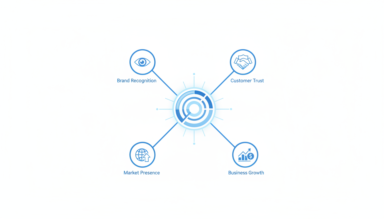
In today's fast-paced world, your small business logo is more than just a pretty picture—it's a crucial part of your brand's identity. Research shows that a staggering 75% of consumers recognize a brand by its logo, making it an essential tool for building recognition and driving consumer decisions. However, crafting a logo that holds up across various real-world placements is no small feat, especially when time and budget are tight.
Enter Quicklogo, an AI-powered tool designed to expedite your logo creation process while ensuring your brand's identity remains consistent and professional. This blog post will guide you through a streamlined, six-step process that takes you from conception to a complete brand kit in under 90 minutes. By the end, you'll not only have a logo that looks great everywhere you need it but also the confidence in your brand's visual consistency, potentially boosting recognition by 80% and enhancing revenue by 23%. Let’s get started on building a logo that works as hard as you do.
Introduction: The Importance of a Strong Small Business Logo
In today's fast-paced world, your small business logo is more than just a pretty picture—it's the face of your brand. Let's drill down into why your logo plays a crucial role in brand recognition and consumer behavior.
First off, consider this eye-opening statistic: a whopping 75% of consumers recognize a brand by its logo rather than any other visual cues. This means your logo is often the first interaction people have with your brand, making it a cornerstone of your marketing strategy. A well-crafted logo instantly communicates what your business is about and helps differentiate you from the competition.
Now, imagine scrolling through your social media feed. 60% of consumers avoid brands with outdated or unappealing logos. If your logo feels outdated or unprofessional, you’re likely losing potential customers before they even visit your website. People tend to associate the appearance of a logo with the quality of a business, so ensuring yours is modern and appealing is vital.
So, what if you could create a strong, recognizable logo in just 60–90 minutes? Enter Quicklogo—an AI tool designed to streamline your logo creation process. With Quicklogo, you can generate multiple professional options tailored to your business description. This is perfect for small business owners who need a fast and efficient way to create a striking logo without the hefty price tag.
By using Quicklogo, you'll not only create a logo but start building a visual identity system. In one sitting, you will produce a logo that fits consistently across different platforms—from website headers to social media profiles and even invoices. This kind of consistency can lead to a noticeable 23% increase in revenue, thanks to enhanced brand recognition.
Your logo is more than an image—it's a fundamental part of your brand's story. Ready to get started with Quicklogo and see what you can achieve? With a robust logo, you not only boost brand recognition but also position your business for lasting success.
Step 0: Quick Pre-Work for Success
Before diving into creating your small business logo, a little prep can make a world of difference. First, let’s focus on a 10-minute brand snapshot. This means gathering essential details about your business: your mission, target audience, and any key themes or emotions you want your brand to convey. This quick brainstorm sets a solid foundation and ensures your logo will resonate with your audience.
Next, embrace the sketch-first approach, inspired by Charley Grey. While it might seem old-school, starting with a pencil and paper sketch lets you explore concepts freely without getting bogged down in digital perfectionism. Even rough sketches can bring fresh, authentic ideas that digital tools might miss. Many find that a simple paper sketch is the core creative step before digitizing ideas.
When it's time to generate designs, using Quicklogo turns your sketches into professional options swiftly. But to avoid generic logos, focus on creating clear and specific prompts for the AI. Specify aspects like color preferences, stylistic elements, and the logo's intended placements—such as digital platforms or printed materials. This ensures the AI can generate viable logo concept directions tailored to your brand.
Key takeaway: Good preparation, like a solid brand snapshot and initial sketches, ensures your logo aligns with your business identity. Aiming for clarity in your AI prompts prevents bland outputs and helps Quicklogo produce distinctive, professional results tailored for your needs.
Starting with this groundwork allows you to leverage AI logo generators effectively, setting you on the path to a logo that's both memorable and adaptable across real-world applications—whether it's on a website header or a social media profile.
Step 1: Generating Multiple Logo Directions
Creating a logo for your small business might seem daunting, but with the right tools and mindset, it becomes an exciting journey of discovery. The first step is generating multiple logo directions, and Quicklogo is your best ally here. By leveraging the power of AI, Quicklogo allows you to explore 3-5 distinct styles quickly, ensuring you find something that resonates with your brand vision.
Why Multiple Directions Matter
Starting with a variety of concepts is crucial. It helps prevent the number one failure mode—choosing a logo that works in theory but fails in real-world placements like your website, social media profiles, and print materials. According to data, logos are remembered 3.5 times more effectively than text-only brand names, making it essential to explore diverse concepts early on.
Leveraging AI for Quick Iteration
Over 40% of small businesses now use AI tools for logo creation, embracing quick iteration as a way to explore different avenues fast. With Quicklogo, you can generate several logo options in seconds, each crafted using machine-learning models trained on thousands of professional logos. This means you’re starting with high-quality, brand-ready options right out of the gate.
Expert Insight: "While AI tools simplify logo creation, long-term brand success requires expertise in design strategy." Embrace the tech, but keep your brand values in focus.
Exploration Without Limits
Your goal is to create a logo that not only looks good but also functions well across all mediums. Aim for diversity in styles—experiment with minimalist designs with single-line elements, or try bold typography with vibrant, high-contrast palettes. Consider options with hand-drawn imperfections or eco-conscious organic shapes with muted tones. This kind of variety empowers you to make an informed choice that truly reflects your brand.
Practical Steps to Start
Prompt Your Concepts: Begin by describing your business succinctly in Quicklogo’s interface. Include keywords like your industry, core values, and stylistic preferences.
Generate Options: Use Quicklogo to create at least 3-5 distinct directions. Don’t be afraid to experiment with different inputs to see a wide range of possibilities.
Evaluate Early: As you browse, think about how each logo might appear on a business card or store sign. Would it stand out in a social media feed? Does it convey the right emotion?
By starting with a variety of logo directions, you not only ensure that you have options that work across various platforms, but you also increase your brand’s recognition potential. This approach isn’t just about seeing what sticks—it's about strategically discovering what truly speaks for your small business.
Step 2: Shortlisting Using a Recognition-Driven Scorecard
After generating multiple logo concepts with Quicklogo, it’s time to narrow down your choices to the perfect design. We’ll do this using a recognition-driven scorecard—a simple tool to objectively evaluate logos based on key principles: color, simplicity, and adaptability. These elements ensure your logo remains memorable and versatile across various applications.
Why This Matters: Logos are remembered 3.5 times more effectively than text-alone brand names, making them essential for brand recall. Also, 89% of users are more likely to remember logos positioned in the traditional top-left placement, emphasizing the need for adaptability.
Creating Your Scorecard: Our aim is to turn subjective taste into objective evaluation. Here’s what to focus on:
Color Discipline: According to research, 80% of people say color plays a key role in brand recognition. Choose a color palette that aligns with your brand's identity and evokes the desired emotional response. A controlled palette (like the single color used by 38/250 top companies) can prevent visual chaos.
Simplicity: A simple design is more adaptable and easier to recognize. Avoid clutter; remember that 60% of consumers avoid brands with outdated or unappealing logos. Opt for clean lines and clear iconography.
Adaptability: Your logo must work on a variety of platforms—from social avatars to invoices. Verify that it looks good in color and black-and-white, and ensure it's legible in sizes ranging from a favicon to billboard signage.
Here's a handy scorecard to rate each design:
Criteria | Score (1-5) | Notes |
|---|---|---|
Color Harmony | Does the color palette suit your brand? | |
Simplicity | Is the design uncluttered and clean? | |
Adaptability | Can it scale well across mediums? | |
Memorability | Is it distinct enough to be remembered? | |
Emotional Appeal | Does it evoke the right emotion? |
How to Use the Scorecard:
Rate Each Criterion: Score each logo from 1 to 5 based on how well it meets each criterion.
Compare Totals: Add up the scores to see which logo stands out.
Review Notes: Your notes will help identify specific elements that work or need refinement.
Pro Tip: A strong logo isn’t only about immediate appeal. It's about creating a sustainable visual identity that grows with your brand.
By focusing on these objective measures, you can confidently select a logo that not only looks good but functions effectively across all your branding needs. For more on professional logo choice, check out our detailed checklist.
Incorporating these insights ensures your logo not only stands out but also consistently supports brand recognition and long-term success.
Step 3: Customizing Your Finalist for System Readiness
Once you've picked a winner from your logo options, it's time to make sure that design is ready for all the practical uses of your small business. This means paying close attention to color discipline, refining typography and spacing, and ensuring your logo adapts well across different formats.
Color Discipline: The Power of Palette
Did you know that 80% of people say color plays a key role in brand recognition? Choosing and sticking to a disciplined color palette is crucial. Start by selecting one or two primary colors that reflect your brand's personality. Did you notice that 38 of the top 250 global companies use only one color? Simplicity enhances recognition and ensures your logo remains adaptable across different backgrounds and mediums.
Takeaway: Limit your color palette to essential tones for maximum impact and adaptability.
Typography and Spacing: Clarity is Key
When it comes to logo typography, simplicity often reigns supreme. Clear, minimalist fonts ensure your brand name remains legible no matter the size of the logo—from tiny social media avatars to large storefront signs. Consider bold typography for visibility, paired with adequate spacing to avoid any visual clutter. This approach reinforces readability and brand memorability.
Choose fonts that match your brand ethos—think modern sans-serif for tech, classic serif for elegance.
Adjust spacing between letters and lines to maintain clarity and balance.
Expert Insight: Logos are 3.5 times more recognizable than text-only brand names, so make sure your text elements enhance this advantage.
Adapting Across Formats: Versatility Wins
Your logo should seamlessly transition between digital and physical platforms. Ensure it's ready for common placements—positioned upper left on websites (remember, 89% of users recall logos placed traditionally). Prepare different file formats with transparent backgrounds for flexibility, and consider icon-only variations for social media profiles.
Here's a quick checklist:
Primary and secondary logo versions for different uses.
SVG and PNG files for scalability and web use.
CMYK versions for print materials.
By focusing on these elements, your logo won't just look good once—it will perform across all the places your brand lives. For more on ensuring your logo files are format-ready, you can explore how to pick the right logo file formats for web and print.
With thoughtful customization, your logo doesn't just become a pretty picture; it transforms into a system-ready symbol of your brand's identity.
Step 4: Exporting and Organizing Your Logo Files
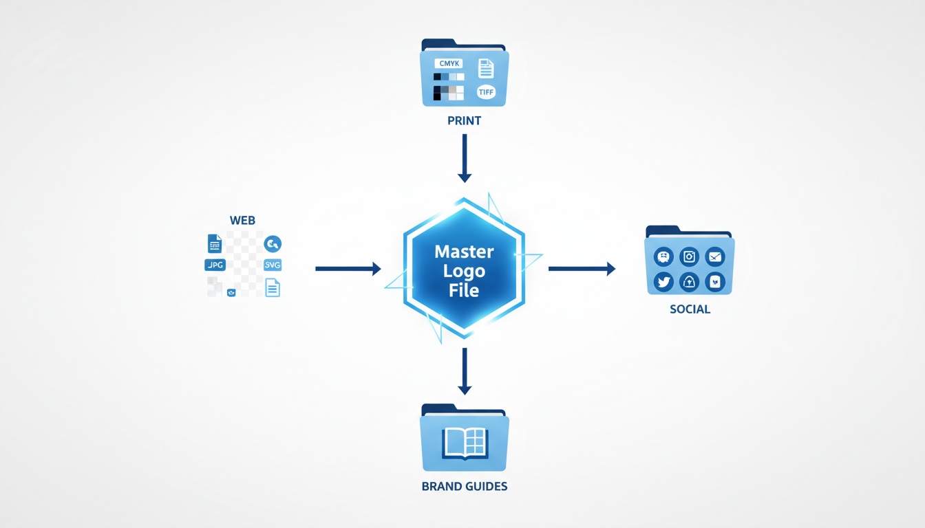
When your small business logo is ready, the next step is to prepare it for all the places it needs to shine. From your website header to social media avatars and physical signage, organizing your logo files effectively is key. Let's dive into how you can maximize your logo's versatility and ensure it always looks sharp.
Critical Formats
Getting the right file formats is crucial. The most important ones include:
PNG: Ideal for digital use, PNG files offer high quality and support transparent backgrounds—perfect for layering your logo over images or colorful backgrounds on your website.
SVG: As a scalable vector format, SVG is excellent for ensuring your logo appears crisp on any screen size. It's a must-have for digital graphics that need to be resized frequently without losing quality.
JPG: Use this format for non-transparent applications where size may be a concern. It's compatible with all types of online use but keep a high resolution to avoid pixelation.
For a deeper dive, check out our file format guide that covers even more details.
Common Placements
Once you've exported your logo files, it's time to think about their placements:
Web: Your logo should appear in the top-left corner of your website, a placement 89% of users remember. It's also vital to ensure compatibility across mobile and desktop versions.
Social Media: Platforms like Instagram and Facebook often require specific dimensions. A square or circular version of your logo works wonders here. SVG or high-resolution PNG files are typically the best choices due to cropping flexibility.
Print: Whether on business cards or invoices, your logo must be crisp and legible. A high-resolution JPG is generally suitable for print, but if you anticipate significant scaling, opt for an SVG.
Organizing Your Files
To keep everything neat and ready-to-use, categorize your files by format and intended use. Here's a handy markdown table for organization:
Format | Use | Details |
|---|---|---|
PNG | Web, Digital overlays | Transparent background, high resolution |
SVG | Web, Print, Scalability | Infinite scalability, editable in vector tools |
JPG | Print, Websites | High resolution, smaller file size |
Remember, consistent use of your logo can boost revenue by 23%. By methodically preparing your files, you ensure flawless branding across all platforms.
Your next step? Test your logo in various placements and formats to confirm it maintains its integrity and impact. With Quicklogo, generating these crucial formats is just a click away. Happy branding!
For the image placeholder:
## Step 5: Building a Basic Brand Kit for Consistent Use
Creating a **brand kit** is an essential step to ensure consistent and recognizable branding for your small business. Consistent use of your logo across platforms can increase revenue by up to 23%, largely due to enhanced brand recognition and trust. So, let’s dive into how you can craft a **lightweight, usable brand kit** that will keep your visuals aligned and appealing.
### Logo Lockups: Versatility is Key
Start by preparing **logo lockups**—these are variations of your logo that accommodate different orientations and uses. You might have a primary logo, but also consider secondary adaptations, like a simplified icon version for social media avatars or a horizontal format for website headers. Quicklogo, with its customization options, allows you to create these variations easily. This flexibility ensures your logo looks great whether it’s on a business card or a store sign.
### Color Palette: The Power of Discipline
Color plays a pivotal role in brand recognition, as 80% of people associate a color with a brand. Choose a simple yet powerful color palette. Research shows that 38 of the top 250 global companies use just a single color for their logos. Using Quicklogo, you can experiment with different palettes before settling on one that not only looks good but also resonates with your brand values. Remember, sticking to a limited color palette across all materials is key to building brand recognition.
### Typography: Consistent Fonts, Professional Appearance
Fonts convey personality just as much as colors do. Decide on specific fonts for your brand and use them consistently. Quicklogo allows you to incorporate your chosen typography directly into logo variations, maintaining cohesion. For instance, you might choose a bold font for headlines and a more readable font for body text—this combination helps maintain professionalism and legibility.
### Usage Rules: Keep It Consistent
Establishing clear **usage rules** for your logo and branding elements prevents inconsistency. Outline where and how each version of your logo should be used, what background colors are acceptable, and how much space should surround the logo. These guidelines ensure your branding elements always look as intended, no matter who’s handling them. Even with minimal design experience, setting these rules can significantly impact how recognizable and polished your business appears.
### How to Build Your Brand Kit
- **Identify Logo Variations**: Use Quicklogo to create multiple lockups suitable for various applications.
- **Select Your Color Palette**: Limit to 1-3 cohesive colors to strengthen brand identity.
- **Choose Typography**: Decide on a primary and secondary font for consistency.
- **Define Usage Rules**: Document guidelines for how your logos and elements should appear in different contexts.
By organizing your logos, colors, and fonts into a cohesive **brand kit**, you streamline the process of maintaining a professional image across all mediums. This sense of consistency builds trust and makes your brand more memorable to consumers. With Quicklogo’s tools, you can swiftly put together these elements, readying your business for visual success across platforms.
## Step 6: Deploying Your Logo Consistently for Maximum Impact
Once you've crafted your logo with Quicklogo, the next critical step is ensuring it makes an impactful debut across various platforms. It's not merely about having a logo; it’s about strategic placement and consistent usage to maximize brand recognition and drive a revenue increase.
### Top-Left Placement for Easy Recognition
Research shows that **89% of users** are more likely to remember logos positioned in the traditional top-left corner of a layout. This is because users naturally scan websites and documents from left to right, top to bottom. When you place your logo here, it’s the first element to catch their eye, making your brand immediately recognizable. So, whether it’s in your website header, email template, or any digital interface, ensure that your logo occupies this prime real estate.
### Social Media Profiles
Your logo should also be your go-to for social media profiles. Each platform has unique sizing requirements, so it's essential to have variations of your logo adapted for different uses. These variations maintain visual consistency and help your audience quickly recognize your brand on social feeds. Remember, logos are remembered **3.5 times** more effectively than text alone, so a consistent visual identity is vital.
### Invoices and Real-World Applications
Beyond the digital realm, your logo needs to work well in print. This includes invoices, business cards, and any product packaging you might use. Consistent logo usage across all these touchpoints contributes to an **80% increase in brand recognition**. Plus, there’s a tangible result: an average **23% revenue increase** linked to consistent branding. Make sure to export your logo in various formats such as PNG for web, and PDF or EPS for print, to ensure quality and clarity in all applications.
### Maintain Consistency Across All Platforms
Consistency is the hallmark of brand trust. Use a lightweight brand kit that includes logo lockups, color codes, and typography rules to keep everything uniform. This approach prevents palette chaos and ensures that every piece of content aligns with your brand's identity.
By utilizing Quicklogo’s easy-to-use tools for generating and customizing logos, ensuring the correct file formats, and strategically deploying your logo across platforms, you're setting the foundation for a strong, memorable brand presence.
For more detailed guidance, you can explore [How to Customize an AI Logo After Generation in Quicklogo](https://quicklogo.design/blog/customize-ai-logo-quicklogo).
## FAQ and Troubleshooting Common Issues
When creating a small business logo, you might encounter some common hurdles. Let’s tackle these with clarity and practical tips.
### Options Overload
**Feeling overwhelmed by too many logo options?** Start by using a **scorecard approach** to narrow down your choices objectively. Consider elements like color simplicity, scalability, and adaptability. Remember, many small businesses benefit from using AI-driven tools like Quicklogo to create multiple professional options in seconds. This allows rapid iteration without design expertise. By systematically scoring each option, based on what matters most—like top-left placement adaptability, which makes logos 89% more memorable—you can confidently select a finalist.
### Scaling Issues
**Does your logo look great big, but lose its appeal when small?** This is a common issue. To ensure your logo is versatile across various platforms, test it in different sizes—social avatars, favicon logos, and website headers. Adaptability is key; minimalistic designs often excel here, as they’re less likely to lose clarity at smaller scales. If you’re using a platform like Quicklogo, leverage its customization options to adjust line thickness and contrast. A logo adaptable across scales significantly enhances brand recognition, contributing to an approx. 80% increase in brand visibility.
### Color Customization and Re-Generation Tips
**Trouble with color consistency?** Keep color discipline in mind. Research shows 80% of people find color crucial for brand recognition. Stick to one or two primary colors—38 of the top 250 global companies do this. Tools like Quicklogo offer customization features to tweak colors easily, ensuring they align perfectly with your brand identity. If you’re not satisfied, don’t hesitate to regenerate. Iteration is a strength of AI tools, allowing you to refine and perfect until you hit the right balance.
> **Takeaway:** Consistency and adaptability are key to effective logo design. Make use of the right tools to balance creativity with strategic brand considerations.
For more detailed guidance on creating a professional logo efficiently, explore resources like [how to generate a logo online with Quicklogo](https://quicklogo.design/blog/generate-logo-online-quicklogo). This comprehensive step-by-step guide will walk you through maximizing the potential of AI in logo design.
## Frequently Asked Questions
### What are the best formats for a logo?
PNG and SVG are great for web use, while JPG is suitable for print.
### How can I ensure my logo remains consistent across media?
Use a brand kit with standardized color codes, fonts, and spacing rules.
### Why is logo color important?
80% of people say color plays a key role in brand recognition.
### How many logo options should I generate initially?
Start with 3-5 distinct directions to explore diverse styles.
### What do I do if my logo looks good large but not small?
Adjust simplification and ensure clarity in smaller formats.
## Final Thoughts
Building a brand starts with seeing your logo as a dynamic system. By considering how each element works together to represent your business, your brand kit becomes a cohesive force across all platforms. Here's a quick recap of the 6-step workflow to create a compelling small business logo:
- Define your brand identity.
- Research your industry and competition.
- Sketch ideas and concepts.
- Select colors and typography.
- Use Quicklogo to generate initial designs.
- Refine and finalize your selection.
Creating a memorable logo doesn't have to be overwhelming. With tools like Quicklogo, you can efficiently generate and refine your designs to suit your brand's needs. Ready to start? Generate your first batch of logos with [Quicklogo](https://quicklogo.design) and bring your brand vision to life. For more detailed guidance, explore our internal guide on choosing a professional logo and understanding file formats.
Back to all posts