

15 Brand Assets to Create After You Generate a Logo
After generating a logo, it's crucial to create essential brand assets for a consistent launch. Explore a checklist of 15 items needed for effective branding.
Quicklogo Team
15 Brand Assets to Create After You Generate a Logo
A logo isn’t an asset library. Instead, it’s the gateway to a comprehensive brand assets list — a pivotal step towards turning your brand vision into reality. In today’s digital-first market, where consistency and speed are critical, you’re not ready to launch until your logo is primed for every channel. According to global research, the world’s top 100 brands are valued at an astonishing $7.5 trillion, projected to grow significantly. This illustrates the tangible impact of cohesive branding. This post serves as your one-stop, founder-ready guide to transforming a logo into a complete brand asset system in just one sitting. You’ll uncover the 15 essential assets you need immediately after logo creation and how Quicklogo’s workflow can streamline this process. Let’s dive in and ensure your brand doesn’t just start strong — it launches with impact.
Intro: Beyond the Logo – Building a Brand Asset System
Think about the last time you heard someone say, "I've got my logo, so I'm all set." It's a common misconception that a logo marks the end of a brand's visual journey. In reality, a logo is just the beginning. It's your starting file in an interconnected system of brand assets that need to be created, adapted, and deployed across various channels. This is where the real work begins, and Quicklogo can be your ally in this process.
Imagine your logo as the tip of an iceberg. Beneath lies the foundational structure—a system of brand assets that ensures your business looks consistent and professional wherever it appears. This is crucial because, according to Brand Finance, the world's top 500 brands are projected to grow to nearly $9.5 trillion in 2025. The secret sauce? Consistent execution across touchpoints.
Here's what many startup founders don't realize: the value of your brand grows exponentially when executed with consistency and speed. Quicklogo helps you achieve this by allowing you to generate, select, and export your logo and its variations efficiently. This isn't just about having a logo; it's about having a full brand asset list—think social media avatars, favicons, website headers, and more—ready at your fingertips.
"Disruptive brands fuel long-term brand value," notes Kantar BrandZ. The importance of a well-rounded brand asset system becomes evident when you see how tech leaders like Apple and NVIDIA grow. By embedding Quicklogo's streamlined workflow, you too can build a cohesive brand quickly.
So, forget the finish line. Let's focus on launching with all cylinders firing, creating a brand system that stands tall in today's fast-paced digital world. Whether it's a horizontal logo for your website or a high-resolution file for print, consider your logo the beginning of a branding powerhouse.
Why Consistent Brand Assets Matter
Imagine turning your logo into a seamless asset system deployed everywhere your brand touches. It's not just about having a logo; it's about creating a cohesive brand identity where every asset holds the same visual language. Why does this matter? Consider the numbers. The world’s top 100 global brands soared to a combined value of $7.5 trillion in 2024, with projections to hit $8.1 trillion in 2025. This success isn't just about having a recognizable name—it's about consistency across every brand touchpoint.
Research by Brand Finance and Kantar BrandZ underscores the importance of brand consistency in driving business value. As the market continues to evolve, the strength of disruptive, tech-led brands plays a significant role in long-term brand value. Take tech giants like Apple, with a brand value of $574.5 billion in 2025, reflecting an 11% growth. Such growth illustrates the power of a solid, recognizable brand identity that extends beyond a logo.
Creating consistent brand identity assets ensures that every piece of communication—from social media graphics to website headers—reinforces your brand’s message and aesthetic. This consistency builds trust, amplifies recognition, and ultimately adds to the perceived value of your brand. Don't fall into the trap of inconsistent execution, which can dilute your brand message and confuse potential customers.
"Disruptive brands fuel long-term brand value," highlights Kantar BrandZ. Consistency is key to leveraging this disruption for growth. With tools like Quicklogo, generating and managing these assets efficiently becomes a streamlined process, allowing you to maintain brand consistency effortlessly across all channels.
Aligning each asset with your core visual identity isn't just an aesthetic choice—it's a business strategy that underpins brand growth, customer loyalty, and market success.
How to Use This Brand Assets List
Starting a brand launch can feel overwhelming, but with the right approach, you can turn your logo into a full-fledged brand identity in just 60–120 minutes. The key is a focused sprint that prioritizes what you need most.
1. Prioritize Asset Creation by Channel Importance
Begin by identifying the platforms where your brand will be most visible during launch. Typically, this includes your website, social media profiles, and any sales collateral, such as pitch decks or business cards. By focusing on these high-impact channels, you're ensuring your brand appears professional and cohesive from day one.
- Website: Ensure you have logo variants that fit your header and favicon requirements.
- Social Media: Prepare profile pictures, cover photos, and post templates.
- Sales Collateral: Have a polished email signature and a consistent pitch deck template.
2. Adopt a Generate → Customize → Export Workflow
Using a tool like Quicklogo optimizes your workflow, allowing you to generate multiple logo options, customize the winning design, and export necessary assets efficiently. This approach saves time and ensures consistency.
- Generate: Start with Quicklogo to produce multiple logo variations. This eliminates the one-size-fits-all trap and offers tailored solutions.
- Customize: Adjust the chosen logo for different formats—consider light/dark versions and scaled options for different uses.
- Export: Quickly download multi-format files to cover all touchpoints, whether digital or physical.
3. Avoid Common Launch Mistakes
Ensure you don't fall into common traps like inconsistent color usage or incorrectly sized images. With digital-first assets being non-negotiable due to a 48% rise in e-commerce (contrasting stagnant apparel growth), crisp execution matters.
“Disruptive brands fuel long-term brand value,” according to Kantar BrandZ. Consistency and speed are critical.
By employing these strategies, you'll not only complete your brand assets list quickly but also ensure your brand is represented effectively across all channels. This comprehensive, production-oriented approach positions you for a powerful launch.
1. Social Media Profile Icons
Your logo's journey starts with establishing a consistent identity across social media platforms, where profile icons are seen most frequently. These icons don't just serve as placeholders; they're the digital face of your brand, appearing on users' feeds, profiles, and story highlights. Visibility is crucial because social platforms amplify brand recognition through repetitive exposure. Ensuring your logo looks polished and professional here can significantly elevate your brand's perceived value.
Common mistakes to avoid? Misaligned formats and improper sizing are big culprits. It's all too easy to grab a logo file, throw it into your profile, and end up with awkward cropping or pixelation. Most platforms, such as Facebook, Instagram, and Twitter, have specific dimension requirements (often around 400x400 pixels), and ignoring these can lead to distorted images. Also, be cautious with backgrounds—icons with intricate details or non-transparent backgrounds can appear cluttered or unclear.
Using Quicklogo, it's a breeze to tackle these challenges. You can generate multiple icon styles and adapt them efficiently. Quicklogo supports variations such as light/dark modes or icon-only versions, ensuring your profile icon is versatile and professional. Customize these icons and export them in multi-format options to fit perfectly on any platform.
Key takeaway: Aim for clarity and uniformity in your social media icons to ensure brand recognition and trust. The right execution can make a massive difference in a noisy digital space.
With Quicklogo's streamlined workflow, generating and refining your social media icons becomes a quick, easy task. Say goodbye to the frustration over inconsistent visuals and put your best foot forward across all your social channels.
2. Website Header Logo
When it comes to creating a website header logo, the game is all about responsive sizing and background transparency. A common launch week pitfall is logos appearing stretched or awkwardly cropped, which can quickly tarnish your brand's first impression. To prevent this, ensure your website header logo is designed with a responsive mindset, meaning it adapts seamlessly to different screen sizes and devices.
Why It Matters
Your header logo is often the first thing visitors see, setting the tone for your brand. Given that e-commerce retail has surged by 48% post-pandemic, your digital presence is more crucial than ever. A polished web header logo aids in conveying professionalism and reliability. With tech and services leading brand value categories, having a crisp and adaptable digital asset is paramount.
Variations and Export Tips
Consider creating both light and dark variations of your logo. These versions ensure visibility and brand consistency across different website themes and backgrounds. Quicklogo makes this easy by providing customization options, allowing you to tweak colors and refine styles efficiently. Exporting in multiple formats like PNG for transparency is recommended, so your logo looks sharp and professional regardless of its placement.
For streamlined export from Quicklogo for various devices, adhere to these tips:
- Use horizontal layouts for better fit in web headers.
- Ensure transparency in the background to avoid clashing with site elements.
- Export in standard dimensions aligned with major web platforms.
Common Mistakes to Avoid
Avoid using a single size for all platforms. Instead, tailor the dimensions to fit each application—desktop, mobile, or tablet—to maintain brand integrity. Quicklogo’s multiple format delivery allows you to efficiently adapt and deploy your logo without losing quality.
By harnessing Quicklogo's AI capabilities, you can rapidly generate and refine these variations, keeping your brand identity consistent and professional across the digital landscape.
3. Email Signature Logo
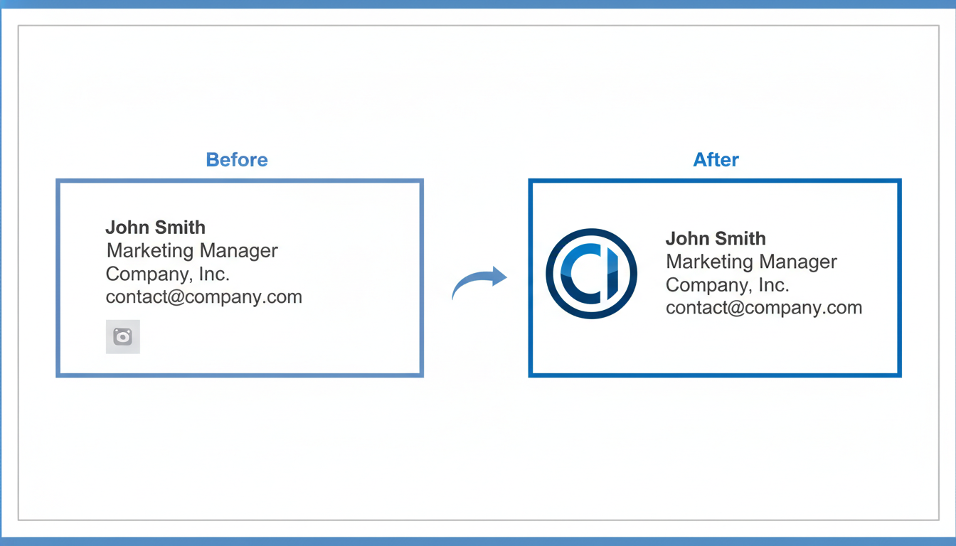
The email signature logo is a subtle yet powerful brand asset that communicates professionalism at every digital touchpoint. Think of it as a small investment that delivers big on brand consistency and helps make a lasting impression with every message you send.
Why You Need It
Your email signature is more than just a personal identifier—it's a miniature billboard for your brand. Crafting an effective email signature logo ensures that every email automatically reinforces your brand identity. According to Kantar BrandZ, effective branding significantly contributes to overall brand value, emphasizing that even seemingly minor assets play a crucial role in driving perception. By integrating a logo into your email signature, you create a cohesive brand experience, ensuring that your identity remains consistent across all communication platforms.
Variants to Create
It's essential to prepare variants of your logo tailored for different email client backgrounds. Export versions for both light and dark email environments to maintain visibility and clarity across devices. For designs with text or intricate elements, it's crucial that your logo remains legible when scaled down, ensuring effective branding even in constrained spaces.
Specs & Variants
- Dimensions: Typically, a size of 300x100 pixels works well.
- Formats: PNG format is recommended for its combination of quality and manageable file size.
- Colors: Choose a color scheme that complements both light and dark backgrounds.
Quicklogo Workflow
With Quicklogo, you can generate these variations effortlessly. Use Quicklogo's customization options to tweak your logo's visibility against different backgrounds and export multiple formats, ensuring your email signature remains crisp and professional. Quicklogo’s intuitive interface allows you to cycle through different styles and customize them to perfectly align with your brand's theme.
Common Mistakes
Avoid using low-resolution images that might pixelate, which can detract from a professional look. Also, steer clear of overly complex designs that lose detail in smaller formats. Instead, focus on clean, simple designs that are easily recognizable.
Incorporating a well-prepared email signature logo not only enhances your brand's credibility but also echoes the broader trend towards consistent branding noted by global brand value studies. Stay ahead by ensuring every email you send reinforces who you are and what you stand for.
4. Favicon
A favicon may seem minor, but it's vital for brand recognition in web browsers and bookmark lists. This tiny icon is your brand's digital ambassador, instantly recognizable among numerous open tabs. In a world where consumers navigate countless websites daily, having a distinctive favicon ensures your brand stands out.
What It Is & Why You Need It
A favicon is the small icon that appears next to your website URL in a browser tab. Despite its size, it plays a crucial role in consistent brand visibility. Without a proper favicon, your site could appear incomplete or unprofessional, which may subtly impact how your brand is perceived.
Common Mistakes & Sizing Pitfalls
A frequent issue with favicons is incorrect sizing or poor resolution, which can make them look blurry or pixelated. Favicons should be designed with clarity in mind, often at 16x16 pixels, but producing them at multiple sizes like 32x32 and 48x48 ensures they display well across various devices.
Quicklogo Workflow
Here’s where Quicklogo shines—enabling you to quickly create favicons in the right sizes and formats. Utilizing Quicklogo, you can generate a favicon from your main logo, ensuring cohesion across brand assets. After generating your multiple logo options with Quicklogo, you can easily customize and export them as favicons using the platform’s intuitive tools.
Export Variants & Best Practices
When exporting, consider creating both light and dark versions to maintain visibility whether users have light or dark themes enabled in their browsers. Quicklogo allows for seamless customization and export, making sure your favicon is as flexible as your brand needs it to be. Store these files in .ico and .png formats for maximum compatibility across browsers.
Takeaway: "A favicon, though small, is a mighty symbol of your digital presence. Get it right, and you're well on your way to robust brand consistency."
With these insights, your favicon can effectively contribute to a seamless brand experience across digital platforms, reinforcing your brand identity at every click.
5. Business Card Design
When it comes to networking, business cards remain a tangible and impactful part of your brand identity. While much of branding has moved online, handing someone a well-designed business card still carries significant weight. It offers a personal touch that digital exchanges often lack, making it an invaluable tool for initial impressions.
Why Printed Materials Still Matter
Business cards serve as a concise visual summary of your brand. They create a lasting connection, often serving as a takeaway from first meetings. In industries where relationships and trust are paramount, this tangible asset reinforces your brand's professionalism.
Choosing Optimal Card Stock and Size Variations
Selecting the right card stock and size is crucial to convey your brand's quality and values. Opt for a sturdy, high-quality card stock to ensure durability. Standard dimensions are typically 3.5 x 2 inches, but custom sizes can set you apart, adding an element of uniqueness. Remember that the card’s texture, thickness, and even finish (matte or glossy) contribute to the overall perception of your brand.
Quicklogo's Role in Generating Ready-to-Print Files
With Quicklogo, you can effortlessly generate print-ready files for your business cards. Using Quicklogo’s AI-powered platform, you can create multiple professional logo variations that align with your brand identity assets with ease. Customize colors and layouts to maintain consistency with your brand guidelines. Quicklogo supports multi-format file delivery, ensuring you have the necessary vectors and high-resolution images for sharp printing.
Expert Insight: "Disruptive brands fuel long-term brand value," says Kantar BrandZ 2025. Having a cohesive brand identity, starting from your logo to your business card design, is a step towards building that long-term value.
For startup founders, incorporating these brand identity assets into a launch-ready system is streamlined with tools like Quicklogo. This ensures your business cards are not just pieces of paper, but powerful brand ambassadors in every networking scenario.
6. Pitch Deck Template
Creating a pitch deck template is a crucial step in crafting impactful investor presentations. Your pitch deck is often the first detailed look potential investors will have of your brand beyond the logo on your business card. Ensuring it reflects consistency with your branding elevates your credibility and helps you communicate your business story effectively.
First Impressions Matter
First impressions set the tone for your entire presentation. A well-branded pitch deck does more than just look good; it reflects professionalism and attention to detail. Investors are more likely to trust a well-presented brand, which starts with a cohesive visual identity throughout your slides.
Common Layout Mistakes and Design Tips
One frequent mistake is overwhelming slides with text and inconsistent design elements. Stick to the rule of simplicity: use one idea per slide. Maintain consistency with font choices and color schemes—elements easily aligned with your logo using Quicklogo. Consider using visual aids like graphs and charts; they can communicate complex information quickly.
Leverage Quicklogo for Cohesive Slide Branding
With Quicklogo, you can maintain brand consistency by ensuring your logo's treatment, from sizing to color variants, matches across all slides. Quicklogo allows you to generate variations quickly and export your logo in formats conducive to PowerPoint or Keynote. A cohesive look strengthens your brand identity.
Expert Insights
"Disruptive brands fuel long-term brand value," notes Kantar BrandZ 2025. This underscores the importance of a powerful, consistent brand identity, especially when pitching disruptive ideas.
Avoid the pitfalls of spending too much time on aesthetics by using Quicklogo to ensure your logo is ready in all necessary formats and variations. For those embarking on their brand launch checklist, focusing on a polished pitch deck can facilitate smoother investor conversations and highlight your brand's potential.
Above all, remember that each slide in your pitch deck is an opportunity to reinforce your brand's value and leave a lasting impression on potential investors.
7. Social Media Banner
When it comes to building a brand, making sure your social media assets are cohesive is crucial. This includes creating a consistent and visually appealing social media banner that aligns with your brand identity. Here's how to effectively design one using Quicklogo:
What It Is
A social media banner, often seen at the top of profiles, serves as a digital billboard for your brand. It’s where your brand identity elements are prominently displayed, giving viewers an instant impression of your business.
Why You Need It
Social media platforms are often the first place potential customers encounter your brand. A well-designed banner that’s consistent across all platforms reinforces your brand message, as emphasized by Kantar's data, which shows that "disruptive brands fuel long-term brand value." Consistency in branding translates to trust, a factor especially crucial in the digital-first approach where e-commerce retail grew 48% post-pandemic.
Specs & Variants
Optimizing for Platform Dimensions: Different platforms have their own dimension requirements:
- Facebook: 820 x 312 pixels
- Twitter: 1500 x 500 pixels
- LinkedIn: 1584 x 396 pixels
Using Quicklogo, you can swiftly generate and adapt banners to these specifications. Simply utilize Quicklogo’s resizing tools to ensure that your banner looks sharp and professional.
Quicklogo Workflow
With Quicklogo, you can generate a logo and adapt it quickly into a cohesive banner. Here’s a simple workflow:
- Generate multiple logo options.
- Select the most fitting version for your brand message.
- Customize the banner's colors and layout to ensure consistency with your brand palette (#2383E2 as your accent color).
- Download in the required dimensions.
Common Mistakes
- Ignoring Dimensions: Each platform has specific dimension guidelines. Incorrect sizing leads to pixelation or cropped images.
- Overcluttered Design: Keep it clean; focus on essential elements. Use Quicklogo's streamlined customization options to avoid this pitfall.
- Inconsistent Branding: Ensure brand colors and logos are kept uniform across platforms to avoid brand dilution.
Designing a social media banner that captures your brand essence doesn’t have to be challenging. With Quicklogo, you have the tools to create a stellar banner that’s not only visually appealing but also precisely aligned with your branding strategy. Want to dive deeper into setting up these assets quickly? Explore Quicklogo’s guide on launching a logo effectively today.
8. OG Image for Social Sharing
Let’s talk about one of the most overlooked yet vital brand identity assets: the Open Graph (OG) image. This little gem is what people see when they share your links on social media, making it prime digital real estate for enhancing your brand's visibility and engagement.
What It Is
In essence, an OG image is a preview graphic that appears alongside links shared on platforms like Facebook, LinkedIn, and Twitter. These images pique user interest and encourage clicks, making them an essential part of any social media asset toolkit.
Why You Need It
Imagine this: you've shared your blog post on social platforms, but instead of a captivating visual that represents your brand, a random and poorly cropped image appears. It’s a missed opportunity that could diminish your brand’s first impression. Research shows that posts with compelling visuals receive 94% more views than those without. An OG image can powerfully convey your message in a single glance, providing consistency and professional polish to every share.
Specs & Variants
Typically, an OG image should be 1200x630 pixels to ensure optimal display across devices. This size helps maintain quality without slow load times, which is crucial as studies indicate that 53% of mobile users abandon sites that take longer than three seconds to load. Ensure any text overlay is clear and concise, allowing the graphic to speak volumes even in a quick scroll.
Quicklogo Workflow
Quicklogo makes creating stunning OG images straightforward. With its customization options, you can match your logo's color palette, adjust layouts, and add text overlays that resonate with your brand’s voice. This seamless integration simplifies the process, allowing you to export the image in the correct format swiftly.
Common Mistakes
A common error is neglecting mobile users. Always preview your OG image on various devices to ensure readability. Another pitfall is using text-heavy designs. Remember, these images are about branding subtly yet effectively. Keep it clean, on-brand, and attention-grabbing.
Incorporate your new OG image into your brand assets list, and watch it elevate your social media presence effectively. By using Quicklogo, you're not only ensuring consistency but also saving valuable time in the run-up to your launch.
9. Digital Ad Visuals
When it comes to structured ad campaigns, digital ad visuals are paramount. They not only boost brand visibility but also drive engagement and conversions. Getting these visuals right can be the difference between a campaign that thrives and one that flops.
Why Digital Ad Visuals Matter
Ad visuals are the frontline in catching your audience's attention. They create the first impression and convey essential brand messages instantly. Consistent ad visuals across platforms maintain brand consistency, reinforcing your brand identity and increasing recognition. With the digital ad spend growing rapidly in tech sectors, it's crucial to ensure your visuals are on point.
Creating Variations for AB Testing
To optimize ad performance, creating multiple variants of your visuals for AB testing is essential. This approach allows you to determine which elements resonate best with your audience, whether it's a specific color, image, or call-to-action. By testing different versions, you can refine your visuals for the most impact, thus improving ROI.
How Quicklogo Simplifies the Process
Quicklogo streamlines the creation of digital ad visuals by enabling rapid generation of multi-format assets. With its AI-driven tool, you can create compelling ad visuals quickly—perfect for the fast-paced demands of ad testing.
"Disruptive brands fuel long-term brand value," as noted by Kantar BrandZ, and a key element of disruption can be swift adaptation in your ad strategy.
Common Mistakes
One common pitfall is not tailoring visuals to different platforms and audiences. Avoid using a one-size-fits-all approach; each platform has unique specifications and audience dynamics. Also, ensure image quality remains high across all formats to maintain professionalism and brand trust.
For a seamless asset creation experience, Quicklogo allows you to generate, customize, and export your visuals efficiently, ensuring your ad campaign is ready to launch with precision and consistency.
Using Quicklogo, you can quickly craft and deploy ad visuals, leveraging their multi-format capabilities to maintain consistency across all your branding touchpoints.
10. Company Apparel Design
Creating company apparel isn't just about style—it's a strategic move that boosts team unity and brand visibility. Imagine your team wearing custom T-shirts or hoodies at an event; it not only fosters a sense of belonging but also turns each member into a walking advertisement for your brand. This kind of visibility is crucial, especially in crowded marketplaces where differentiation is key.
Common design errors often revolve around poor logo placement and color clashes. Make sure your logo is comfortably visible and legible at various sizes. Avoid overly complex designs that can be difficult to reproduce on fabric. Opting for quality materials that complement your brand colors is equally important, as it reflects on the overall brand identity.
Using Quicklogo can ease the process by allowing you to preview how your logo will appear on different types of apparel. With Quicklogo, you can explore various color combinations and logo placements, ensuring your apparel aligns perfectly with your brand identity assets. This tool ensures that your branding checklist is complete and cohesive.
"Disruptive brands fuel long-term brand value" - Kantar BrandZ 2025. This underscores how a strong, consistent visual presence, like company apparel, can contribute to long-term brand growth.
A common mistake during launch week is rushing the selection of merchandise without thorough reviews of design placement. Consider conducting a quick internal survey to gather team feedback on design preferences before finalizing your selections. This not only engages your team but also ensures that the apparel resonates with those who will wear it.
By integrating Quicklogo into your apparel design strategy, you achieve brand consistency with ease, ensuring that every piece of clothing worn by your team enhances your market presence effectively.
11. Product Packaging
Understanding the Impact
Product packaging is more than just a container for your product—it's a powerful extension of your brand identity assets. It significantly influences consumer perception, serving as the first tactile interaction customers have with your brand. According to Kantar BrandZ, brands like Apple and Tesla emphasize sleek, minimalistic packaging design that reinforces their high-value market position. In fact, effective packaging can enhance brand value and drive consumer loyalty, aligning with findings that suggest global brands will reach a value of $9.5 trillion by 2025.
Design Considerations
When designing packaging, color accuracy and print quality are paramount. It's crucial to ensure that your logo and brand colors translate seamlessly in print, maintaining brand consistency. This is where Quicklogo excels. By utilizing multiple file formats, you can ensure your designs look just as stunning on a box as they do on a screen. Whether it's a dark-on-light variation for a sleek look or a vibrant design for eye-catching shelf appeal, Quicklogo's tools help streamline the creation of print-ready layouts.
Quicklogo's Role
Quicklogo supports a variety of customization options, allowing adjustments to fit different packaging needs effortlessly. The platform offers a fast and efficient way to generate logo variants and other brand elements that are crucial for print designs. Utilizing Quicklogo's multi-format export capabilities ensures you have ready-to-print files handy to avoid common launch week hiccups like color discrepancies or resolution issues.
Common Mistakes
A frequent slip-up is not testing how your packaging appears in different lighting conditions, resulting in a washed-out or overly saturated final product. Additionally, neglecting to print proof samples can lead to costly last-minute changes. Avoid these pitfalls by iterating your designs and consulting with print specialists early in the process.
By leveraging the right tools and strategies, you can turn your packaging into a compelling brand asset that not only protects the product but also elevates your brand's perceived value.
12. Interactive Brand Handbook
In today's fast-paced digital environment, an Interactive Brand Handbook is indispensable. This isn’t just a document; it’s a central guide that ensures your team and partners are always aligned with your brand’s identity. What goes into crafting this essential tool? Let’s dive in.
Imagine having a centralized space where your brand’s color palettes, typography, and logo usage rules are all clearly defined and easily accessible. This handbook is pivotal for maintaining brand consistency, crucial given that the world’s top 100 brands are valued at $7.5 trillion, emphasizing the importance of coherent brand identity.
What to Include
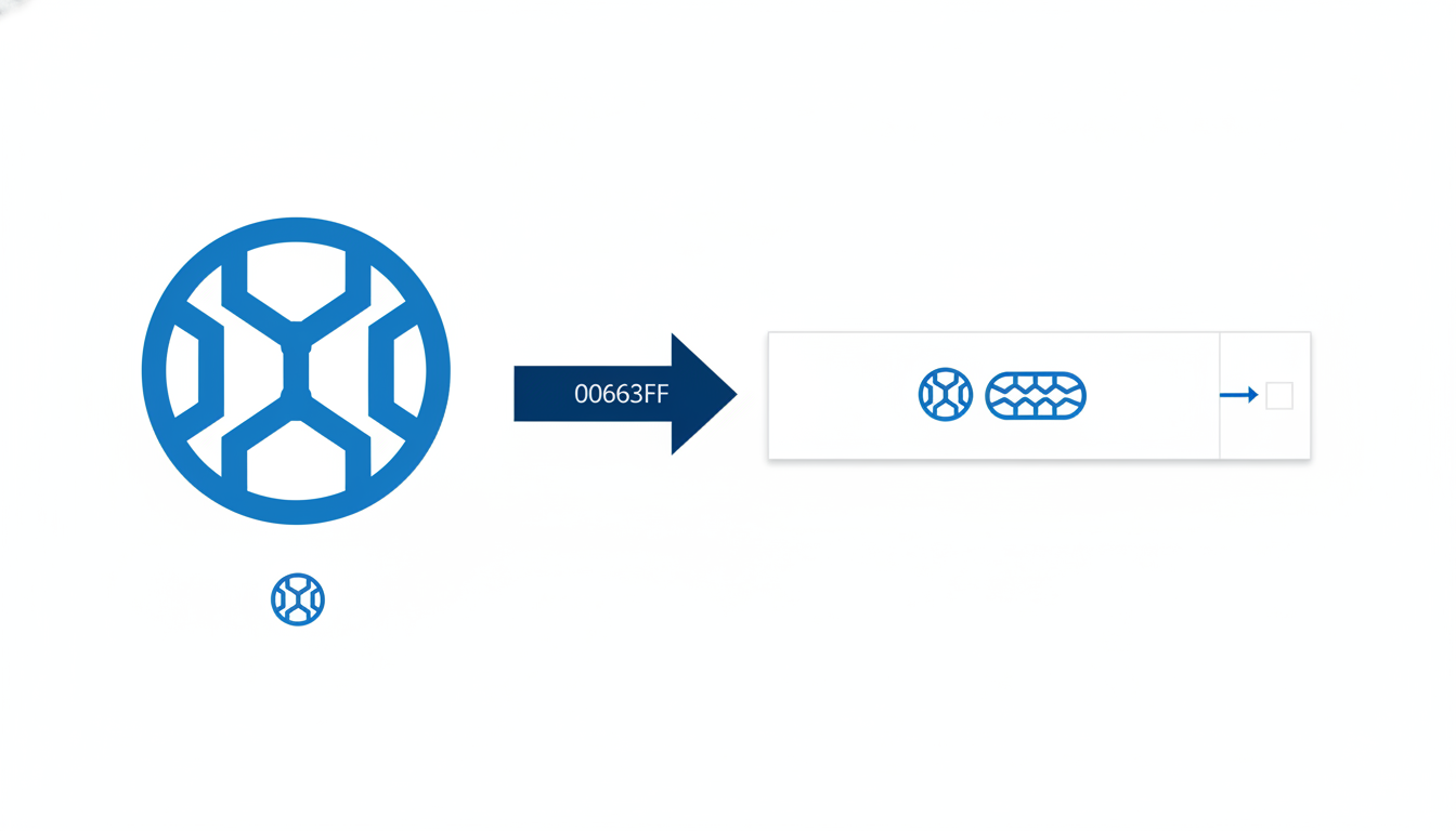
Color Palettes: Clearly delineate your primary and secondary color schemes. Use digital codes (e.g., #2383E2) to ensure precise color matching across all platforms. Consistent color branding is known to increase recognition by over 80%.
Typography: Specify the fonts to be used in various contexts, from headers to body text. This will avoid the common pitfall of mismatched and unprofessional visuals.
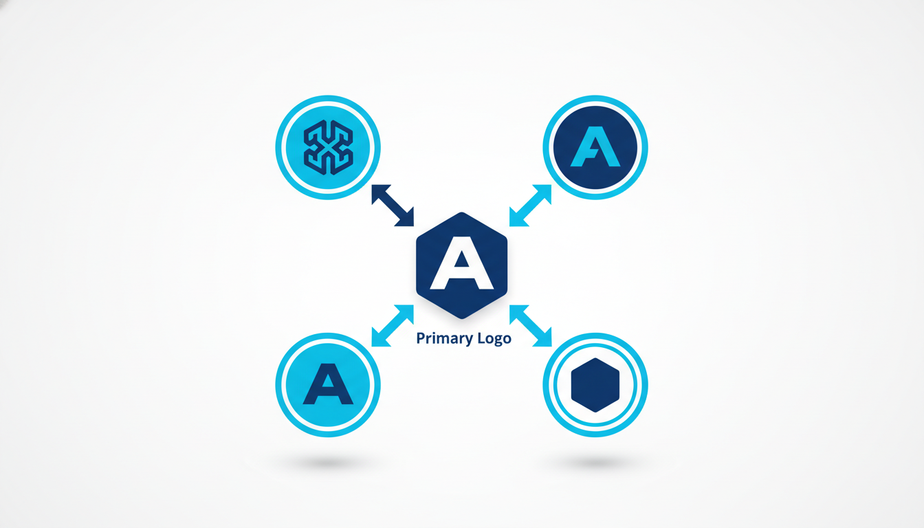
Logo Usage Rules: Detail how to properly use logos, including variations for different backgrounds and formats (light/dark, horizontal/stacked). This addresses the frequent “can you send a transparent version?” requests.
Why Create It
A comprehensive brand kit mitigates the risk of inconsistent branding, which is critical given the projected $9.5 trillion growth in brand value among the top 500 in 2025. Consistency fuels brand value, a key lesson from tech leaders like NVIDIA with a 152% growth spike.
How to Build It with Quicklogo
Utilize Quicklogo for establishing these consistent styles. Quicklogo allows for quick generation and customization of logos, ensuring seamless integration into your handbook. With its fast generation time and multi-format delivery, it simplifies this process dramatically.
Expert Insight: “Disruptive brands fuel long-term brand value,” according to Kantar BrandZ, underscoring the need for robust brand frameworks.
By creating an Interactive Brand Handbook, you not only streamline your brand’s identity for internal and external use but also build a foundation that can handle the demands of rapid growth and change.
13. App Icon
Creating an app icon is essential for any mobile-first brand aiming to establish a strong presence across various platforms. It's your brand’s visual cue in the app ecosystem, much like a storefront on a bustling street. With mobile app usage soaring, a compelling app icon ensures your brand is immediately recognizable.
Why It Matters
App icons aren't just tiny images; they're pivotal components of your digital identity. They need to encapsulate your brand visually and stand out in crowded app stores and device screens. This is crucial given the surge in mobile-first strategies, with e-commerce growing 48% post-pandemic. Consistency here reinforces brand identity, making your app instantly identifiable to returning and potential users.
Getting It Right
One of the biggest challenges is ensuring size consistency across platforms. App icons are required in multiple sizes for various devices and operating systems, from small favicon-like sizes to larger display options. Mismatched or poorly scaled icons can lead to a disjointed user experience.
Quicklogo's Advantage
Here’s where Quicklogo shines. With Quicklogo, you can take your base logo and export it as an app icon across multiple formats and sizes effortlessly. Quicklogo’s multi-format export capability ensures your app icon retains its quality and sharpness, whether viewed on an Android phone or an Apple device.
Common Mistakes to Avoid
It’s common to overlook the specifics of platform requirements. Ensure your icon works well against both light and dark backgrounds and is designed with clear visuals that still look good at smaller sizes. Avoid clutter—simplicity is often more impactful. By utilizing Quicklogo's tools, you can iterate on your app icons quickly, making necessary adjustments on the fly.
Key Insight: "Disruptive brands fuel long-term brand value," says Kantar BrandZ 2025. A well-crafted app icon is a step toward that disruption.
By following these guidelines, you can ensure that your app icon not only supports but enhances your brand's digital strategy, further establishing your presence in the competitive mobile landscape.
14. Storefront Signage
A storefront signage is more than just a decoration; it’s a vital part of your brand identity assets, especially if you have a physical location. Imagine your logo serving as a beacon, drawing customers to your door like moths to a flame. Here’s how to make your logo launch-ready for real-world visibility.
Visibility and Attractiveness
First off, the key insight: storefront signage must grab attention. Whether you're situated on a bustling street or tucked away in a quaint neighborhood, your sign should stand out. Bold colors and clean lines ensure that your branding is noticeable and memorable. As brand value research suggests, consistent and attractive visual markers significantly enhance perceived brand value, which is projected to reach $8.1 trillion by 2025 according to Brand Finance.
Scalability and Resolution
But an eye-catching sign is pointless if it becomes a pixelated mess as it’s resized. Ensure that your designs are scalable and maintain resolution regardless of size. Think vector formats here—these allow for resizing without losing quality—a must-have feature for any brand launch checklist. Consider Quicklogo, which can help you create various logo formats efficiently, ensuring your design looks crisp whether it’s printed on a large billboard or a small digital sign.
Quicklogo’s Role
Quicklogo streamlines the creation of diverse signage formats. The tool’s AI generates high-resolution logos tailored to your specifications, and with multi-format file delivery, you can seamlessly transition your digital designs into tangible assets. Remember to leverage Quicklogo’s customization options to enhance these assets, ensuring your signage resonates with your brand’s aesthetic.
Common Mistakes
A common launch week mistake: skipping the signage mockup stage. Before finalizing, always preview your sign in the real-world environment it will inhabit. This step prevents costly design errors and guarantees that your signage aligns as effectively as possible with your brand identity assets.
Whether your brand is disruptive and tech-led or classically traditional, quick, consistent execution makes all the difference. With Quicklogo, transforming your logo into impactful storefront signage becomes another strategic step in elevating your overall brand identity.
15. Asset Management System Setup
Imagine pouring drinks at a party, but instead of glasses, you’ve got a pile of cups, mugs, and bowls haphazardly scattered about. That's chaos, right? Welcome to the world without an organized Asset Management System.
Setting up a robust system right after your logo is not just smart—it’s essential. Your logo is a starting point, and every asset generated from it needs a home within a comprehensive system. Why? Because this is where your brand thrives or dives. According to Brand Finance, the combined value of the world's top 100 global brands hit $7.5 trillion in 2024, highlighting that organized brand consistency equals power.
Start with naming conventions. Consistent naming helps you quickly locate files. For instance, name your files using a format like BrandName_Type_Date_Version. This might look something like Quicklogo_Header_2023_v1. The key is clarity and standardization, so every team member knows where to find assets at a glance.
Version control is your next go-to. Ever found yourself lost in a sea of “Final2_final_fixed”? No more. Implement a versioning system like v1, v2, etc., so that the evolution of each asset is documented and traceable.
“Disruptive brands fuel long-term brand value,” advises Kantar BrandZ 2025. Organizing your assets can be the change you need for sustainable growth.
Leverage asset management tools to give your system a boost. Tools offer structured folders, metadata tagging, and user access control, which prevent the tangle of files and enhance team collaboration. Quicklogo, for instance, helps streamline this with multi-format exports and storage capabilities within your account—keeping assets at your fingertips.
In setting up this system, reference brand asset management practices. This means keeping abreast of the latest from reputable sources, ensuring your approach aligns with best practices like those from Brand Asset Management.
An organized system is more than storage—it's a strategic advantage. By institutionalizing these processes, your brand's assets remain accessible, consistent, and ready for any launch, making your next big step in business eminently manageable.
Package and Store Your Assets
As you gear up for your brand's launch, it's vital to ensure that your brand assets are well-organized and easily accessible. Effective asset management is the key to maintaining brand consistency across all platforms. Here’s how to organize your assets like a pro.
Organizing Files with Digital Folders
Start by creating a folder structure that reflects your brand's needs. Consider these categories:
- Logos: Separate folders for light, dark, stacked, and horizontal versions.
- Documents: Include brand guidelines, marketing templates, and other essential files.
- Media: Categorize images, videos, and social media assets.
Your goal is to be able to locate any file within seconds. This organization helps prevent the common launch-week scramble for missing files.
Naming Conventions
Consistent naming conventions can dramatically streamline your asset management. Use clear, descriptive names that include version numbers and dates. For instance, name your logo files as “Quicklogo_Primary_Stacked_2023-10-15.png.” This method ensures clarity and avoids confusion over which file is the latest version.
Version Control for Iterative Branding
As your brand evolves, so too will your assets. Implement a version control system to track changes. Store previous iterations in separate folders—this not only preserves your branding history but also allows you to revert to earlier designs if needed.
Key Takeaway: "Consistent asset management not only enhances brand consistency but also supports rapid iteration—essential for tech-driven brands," as noted by Brand Finance.
Best Practices for Asset Management
- Utilize cloud storage solutions like Google Drive or Dropbox for easy sharing and access.
- Implement a regular backup schedule to safeguard against data loss.
- Periodically review and archive non-essential files to keep your workspace clutter-free.
By adopting these practices, you're not just storing assets—you’re creating a system that enhances efficiency and supports your brand's growth. For more on this, check out how Quicklogo helps you customize and store your logos quickly and efficiently.
Using these strategies, you’ll have a robust brand asset management system that keeps your launch organized and stress-free. With Quicklogo, generating and storing your brand elements becomes not only seamless but also secure.
Frequently Asked Questions
What are brand assets?
Brand assets are the elements like logos, colors, and typography that represent your brand visually and communicate its identity.
Why do I need a favicon?
Favicons appear in browser tabs, bookmarks, and address bars, helping users quickly identify your site and reinforcing brand recognition.
How can I make sure my logo looks good on all platforms?
Ensure your logo is exported in various formats and sizes, using tools like Quicklogo to simplify resizing and adapt designs for different contexts.
What formats should my brand assets be in?
Brand assets should be in formats like PNG, SVG, and PDF for versatility across web, print, and digital applications.
Why is brand consistency important?
Consistency strengthens brand recognition and trust, making your brand more memorable and reliable in the eyes of consumers.
Final Thoughts
Creating a cohesive suite of brand assets from your logo is key to leveraging speed and consistency for a successful launch. Prioritize essential elements like your favicon, website header, social avatars, OG image, and pitch deck slide cover. This ensures your brand maintains a polished and professional image across all touchpoints.
Remember, the journey begins with your logo. Use Quicklogo to generate and iterate your logo variations efficiently. Once that's done, refer to our comprehensive checklist to build your mini brand kit seamlessly. For more insights, explore our guides on file formats and logo generation. Ready to launch? Start today with Quicklogo!
Back to all posts